Overview
This article describes the Custom legend of the chart. It is strongly recommended that you read the topic on Default Legend Items before proceeding.
This collection class is exposed as the CustomItems property of the Legend object, and allows for the addition, deletion, etc. of custom legend items. The CustomItems property is available at both design-time and run-time.
Custom Legend Entries
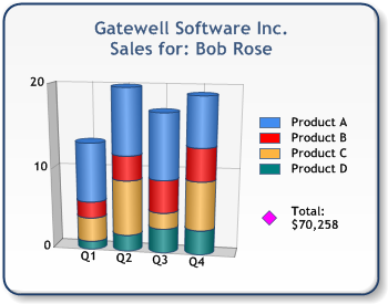
A custom legend item is not associated with data, and can be inserted into the legend via the CustomItems property of the Legend object. Custom items are always appended to any existing default legend items as shown in Figure 1 below.

Figure 1: Custom Legend Item "Total".
The Name property defines the custom legend item's text. The custom legend item's symbol can be displayed by setting the Style property to one of three styles: "Rectangle", "Marker" and "Line".
 Note Note |
|---|
| A "Line" style can be combined with a "Marker" style by setting the Style to LegendImageStyle.Line, and specifying either a marker image via the MarkerImage property or a marker style via the MarkerStyle property. Once you set the LegendItem.Color property, the resulting symbol will then be a combination of a line and image or marker. |
If the Style is Marker, the appearance of the custom legend item symbol is determined by the marker attributes. If Style is Line or Rectangle, the marker attributes do not apply.
Custom Cells
The LegendCells collection gives you the ability to modify each individual cell of a custom legend item. Each cell can have its own spacing by setting the Alignment and Margins properties. All values regarding margins and cell spans are calculated as a percentage of the legend font size.
Three cell types can be used: "Text", "SeriesSymbol" and "Image". These styles determine how each individual cell will be displayed, and are determined by the CellType property.
Text
When LegendCell.CellType is set to Text, the text defined by the LegendCell.Text property is displayed in the cell.
SeriesSymbol
When LegendCell.CellType is set to SeriesSymbol, the series symbol defined by the LegendItem.Style property will be displayed for the cell. When Style is set to Marker, all marker attributes of the custom item apply to the cell. To specify the size of the marker in a custom cell, use the LegendCell.SeriesSymbolSize property to define the width and height of the series symbol. Recall that all values regarding series symbol size are calculated as a percentage of the legend font size.
Figure 2: Types of Series Symbols.
Example
This example demonstrates how to create a new legend item, set its style, color, cell type, and size properties.
| Visual Basic |  Copy Code Copy Code |
|---|---|
| |
| C# |  Copy Code Copy Code |
|---|---|
| |
Image
When LegendCell.CellType is set to Image, the image defined by the LegendCell.Image property is displayed in the cell. Additionally, you can set the size of the image via the ImageSize property. All values regarding image size are calculated as a percentage of the legend font size.
 Note Note |
|---|
| If the LegendCell.CellType property is set to SeriesMarker, and LegendItem.Style is set to Marker, an image can also be set via the LegendItem.MarkerImage property. However, when using images, we recommended that you use the LegendCell.Image property for ease of use and flexibility. |
Cell Span
If the contents of a cell need to extend beyond the cell width, you can set the CellSpan property to any number of cells that should be used to fit the contents.

Figure 3: Cell Span.
Example
This example demonstrates how to create a new legend item, set its text, and SeriesSymbol properties
| Visual Basic |  Copy Code Copy Code |
|---|---|
| |
| C# |  Copy Code Copy Code |
|---|---|
| |
How To
Default Legend Items
Custom Attributes
CollectedLegendText Custom Attributes


