


Overview
A doughnut chart is similar to a pie chart in that it shows how individual portions of data contribute to the overall data as a whole.
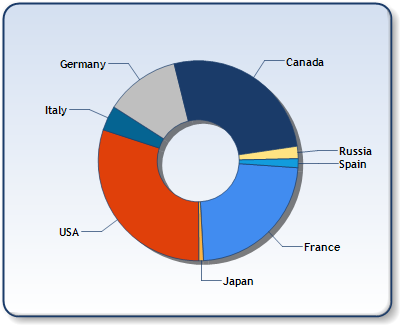
Figure 1: A Doughnut chart.
To change the size of the pie chart change the ChartArea object's Position value, InnerPlotPosition value, or both.
|
Chart Details | |
|---|---|
|
Number of Y values per point: |
1 |
|
Number of series: |
One only |
|
Support markers: |
No |
|
Cannot be combined with: |
Any other chart types |
|
Custom Attributes |
|---|
|
Exploded, PieLabelStyle, DoughnutRadius , |
 See Also
Chart Types
Chart Types Overview
Pie Chart