


Overview
A line chart can be used to illustrate trends in data with the passing of time.
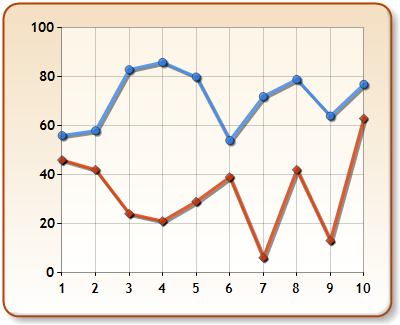
Figure 1: A Line chart.
|
Chart Details |
|
|
Number of Y values per point: |
1 |
|
Number of series: |
One or more |
|
Support markers: |
Yes |
|
Cannot be combined with: |
Doughnut, Pie, Bar, Stacked Bar charts, Polar, Radar, Pyramid, or Funnel |
|
Custom Attributes |
 See Also
Chart Types
Chart Types Overview
Spline Chart