Overview
Axis titles and labels are elements that help to define the use of, and data plotted within any given chart. These items essentially highlight what the chart and its data points are trying to show, and add the necessary context to visually interpret the data displayed. It is worthy to note that some charts, like a pie or doughnut charts, do not use axes to display their data, however, when a chart does incorporate the use of an axis, you can use an axis title to clearly identify it. The use of axis titles helps to clarify the purpose of a particular axis, and the data plotted on it. For example, if the y-axis of a chart shows sales figures, and the x-axis shows store locations, then adding a title to each of these axes goes a long way to define them, and makes the data charted within that particular web part instantly clear to its user.
Axis labels on the other hand, help to define the numerical, or other, scale that is being employed in the axis that they represent. Again, these serve to define, and clarify what data is being plotted, and in what relevant scale. This article describes how to use an axis title or label.
 Note Note |
|---|
| Axes, as well as axis titles and labels are not used or shown in certain chart types like, for instance, Pie or Doughnut charts. Setting these properties in one of these chart types has no effect. |
Adding An Axis Title Or Label
The first step to using either an axis title or label, is to add one to your chart web part. The steps for adding either a title or label are predictably similar, therefore in the interest of brevity, we will show you how to add an axis title, and assume that you can follow the same procedure to add an axis label if so desired.
Follow these steps to add an axis title to your chart:
- With your charting project open, choose Wizard List... from the chart web part tool bar.
- Choose Customize Your Chart from the wizard list. This will open the Chart Customization Wizard.
- From the left navigation pane, expand Step 3: Chart Element Properties, and choose Axes and Grid Lines to open the similarly named tab.
- On the Axes and Grid Lines tab, put a check in the Show Axis Title check box of the axis that you want to work with.
- Enter the text for your axis' title in the textbox provided.
- Set the title's alignment using the dropdown menu provided.
- Set the Show Axis dropdown menu to True.
- Click on the Finish button to complete the task.
Axis Settings
Axis Label
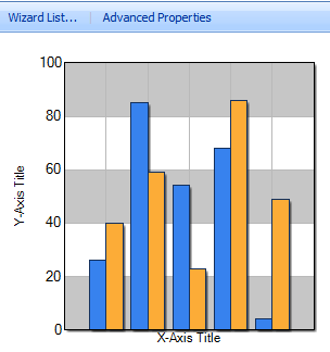
In addition to using an axis title, you can also add an axis label. Axis labels show the scale values of your chart, and help users to identify data point values that are plotted therein. Figure 1 below demonstrates the use of the y-axis label that shows the scale, which proceeds from 0 to 100, used for the y-axis.
Interlaced Property
To further emphasize the scale of your chart's axis, you can also set that axis' Interlaced property. This property adds alternating color bands to the wall of your chart's scale, as shown in Figure 1 below. These color bands act as visual cues to help users identify the value of data points that are plotted within the chart.
 |
| Figure 1: A chart demonstrating both the x-axis and y-axis titles, as well as a y-axis label, and also the use of the y-axis Interlaced property. |


