Overview
Labels are an effective way to identify many critical parts of your charting web parts. They can be used to bring attention to data areas within your chart, or to identify your chart as a specific data container. For example, you may have three charts in your project, and one of those charts may be displaying sales data for your company's European sales division, another may be displaying sales data for your company's North American operations, and so forth. In this case, labels go a long way to quickly and clearly identify these charts according to their respective sales regions, divisions, or territories.
There are many types of labels available for you to use, including:
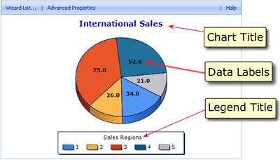
- Web part container title: Shown as number 1 in Figure 1.
- Chart title: Shown as number 2 in Figure 1.
- Axis scale labels: Shown as number 3 in Figure 1.
- Data point labels: Shown as number 4 in Figure 1.
- Custom labels: Shown as number 5 in Figure 1.
 |
| Figure 1: A chart displaying a chart title, data labels, and a legend title. |
The label used depends upon its individual rendering priority, as well as the manner in which it is generated. Labels can be generated using the chart axis scale, its data points, or you can create custom labels using your own specific criteria. Each of these methods is described below.
Labeling Axes
Labels are generated according to an assigned label priority, and it is this priority that dictates which label gets generated, and which one does not. Depending on how you want to generate your chart's labels, you can choose the method that best fits your needs. If you are generating axis labels for your chart, then there are three way in which you can label your chart's axes. We have listed them below from lowest priority to highest priority.
To label your chart's axis you can:
-
Use the axis scale to generate your chart's labels.
-
Generate labels from data points, however, this is only applicable to labels used for your chart's categorical axes.
-
Create your own set of custom labels to use in your chart. Since custom labels have the highest priority, they will be shown in place of any of the above labels, if they exist.
The three methods shown above differ in how the label text is generated. It is worthy to note that different methods can be used for each individual axis. For example, you could use a set of custom labels for your y-axis, while using data point labels for your x-axis. Immediately following is a discussion of each of the three methods mentioned above.
Using The Axis Scale
If custom labels are not used, then the axis scale will be used to generate your label's text, and the data points being plotted will not have their own labels. The label text displayed depends on the maximum and minimum axis values, as well as the axis scale itself. Labels generated in this manner can be displayed in the first label row along with labels that originate from data points.
 Note Note |
|---|
| Using the axis scale method of setting label text gives those labels the lowest rendering priority. Therefore, if a data point label has been specified as being a custom label, then it will get used instead of the label generated by the axis scale. |
Using Data Point Labels
Data point labels are labels that display the value of the data points that are plotted within your chart. However, some axes are considered to be non-value axes, that is axes that do not contain numerical values as is usually the case. Labels for these non-value axes can be generated from data points by using the AxisLabel property. This property lets you associate all data points with their own label. Data point labels can also be combined with labels that are created using the axis scale.
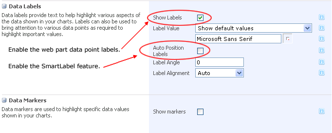
To use data point labels you must enable this feature from within the chart web part customization wizard. Figure 2 demonstrates how to enable the web part data point labels feature. If you want to use the SmartLabels™ feature along with your data point labels, then you must enable the Auto Position Labels option by pacing a check in its check box.
 |
| Figure 2: The customization wizard lets you enable, and configure, the data point labels feature. You can also enable the data point label's SmartLabels™ feature to have these labels rendered in a manner that avoids labelling collisions. |
 Note Note |
|---|
| Labels generated in this manner have a higher rendering priority than labels generated using the axis scale. |


