Overview
In an effort to clarify the data shown in some charting projects, it inherently requires the use of many data labels. When this is the case, it is likely that some sort of rendering collision will occur as many labels attempt to share a common display area. Rendering collisions are said to have occurred when one item, like a label, is rendered over another effectively obscuring all or part of the underlying item. When a rendering collision occurs within a chart it makes the effected items unreadable.
The SmartLabels™ feature of Dundas Chart for SharePoint™ repositions labels in an effort to avoid any such rendering collisions. In Figure 1 below, the chart on the left illustrates the effect of data point labels that have collided with each other, and as a result have become unreadable. The chart on the right however, has had the SmartLabels™ feature enabled, and can display all of its labels without issue.
The SmartLabels™ feature is intended to work only on labels that are anchored to data points. This feature tries to render all labels as close as possible to the data point that each one represents, therefore labels that are not anchored to data points are considered to be absolutely placed, and as such are not affected by the SmartLabels™ feature in any way.
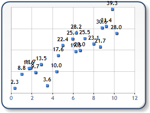  |
| Figure 1: A chart with unreadable labels (shown left), and the same chart after being transformed using the SmartLabels™ feature (shown right). |
Using SmartLabels™
Using the SmartLabels™ feature will help you to overcome rendering collisions by repositioning all of your chart's labels, according to user-defined settings, in order to avoid collisions. The SmartLabels™ settings must be enabled according to the chart element used, which means that if you are using Labels, then you must enable the SmartLabels™ feature from within the Labels properties screen.
Enabling SmartLabels™ For Labels
The Auto Position Labels check box, found on the Data Labels and Markers tab of the Chart Customization Wizard, enables the SmartLabels™ feature. Once enabled, this feature will allow your chart to render many labels in a common display area, without any collision occuring.
 |
| Figure 2: The Auto Position Labels check box enables the SmartLabels feature. |
The SmartLabels™ feature enjoys a broad range of support for many chart types, however all chart types are not supported by this feature. The following is a list of chart types that do not support the SmartLabels™ feature:
- Bar Chart.
- Gantt Chart.
- Pie Chart.
- Doughnut Chart.
- Range Column Chart.
- Stacked Area Charts.
- 100% Stacked Area Charts.
- Stacked Bar Charts.
- 100% Stacked Bar Charts.
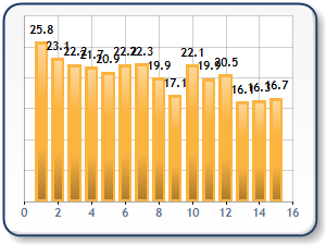 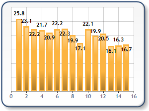 |
| Figure 3: Improving a labeled column chart (shown left) by enabling the SmartLabels™ feature (shown right). |
Callout Properties And SmartLabels™
Callouts use lines to link a label to its corresponding data point. When a labeling collision occurs, the SmartLabels™ feature will first try repositioning an overlapping data point label as near as possible to its corresponding data point. However, when many adjacent data points are present and each has its own label, it becomes difficult, if not impossible, to move a label to a point next to its corresponding data point while still avoiding a collision. In this case, the chart will move the data point label to an empty area of the chart display, and draw a callout line to link that label to its corresponding data point. Like all chart elements, the callout line's visual attributes can be controlled using its many properties.
CalloutStyle Property
The CalloutStyle controls the style of the callout's text area, and can be set to one of the following LabelCalloutStyle values:
- None: The Label is connected to the marker using a simple line.
- Underlined: The Label is underlined and connected to the marker using a simple line.
- Box: A box is drawn around the label, and then it's connected to the marker using a simple line.
The CalloutStyle defines what is displayed at the end of a callout line, in other words this is the text area of the callout element. By default, a simple horizontal line, referred to as the Underline style, is used to underline the callout used with the data point label as shown in the chart on the left in Figure 4 below.
 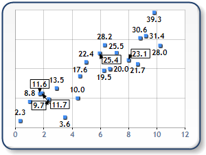 |
| Figure 4: A chart employing the Underline callout style (shown left), and one employing the Box callout style (shown right). |
CalloutLineAnchorCap Property
The CalloutLineAnchorCap property controls the style of callout line's cap, and can be set to display an arrow head, a diamond, a square, or a round cap. If not cap is desired, this property can be set to None, which is its default value.
CalloutLineColor Property
The CalloutLineColor property sets the color of the callout line , and can be set to any Color object. Setting the color of the line will also set the color of the CalloutLineAnchorCap and the element defined by the CalloutStyle property.
CalloutLineWidth Property
The CalloutLineWidth property controls the pixel width of the callout line. Using this property will also scale the decorations of the CalloutLineAnchorCap and the CalloutStyle properties.
CalloutLineStyle Property
The line style of the callout line is controlled using the CalloutLineStyle property, and can be set to one of several ChartDashStyle line styles which include the following:
- NotSet: This is the default value.
- Dash: Specifies a line consisting of dashes.
- DashDot: Specifies a line consisting of a repeating pattern of dash-dot.
- DashDotDot: Specifies a line consisting of a repeating pattern of dash-dot-dot.
- Dot: Specifies a line consisting of dots.
- Solid: Specifies a solid line.
Putting It All Together
Figure 5 displays a chart where a number of callout properties have been customized.
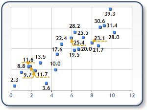 |
| Figure 5: A chart displaying its data points after applying various Callout property settings. |
Example
This example demonstrates how to use the Dundas Chart: Code Editor to set some of the callout properties. In this example, we first create a SmartLabelStyle object, and then proceed to set its callout line width, anchor cap, and callout style properties from within the PostInitialize event handler. The results of these settings are shown in Figure 6 immediately following this example.
[VB.NET]
' Using the chartObj parameter, cycle through all data series of the chart
' and set various callout properties.
For Each dSeries As Series In chartObj.Series
        ' Set the callout line color property.
    dSeries.SmartLabels.CalloutLineColor = Color.Green

    ' Set the callout anchor cap property.
    dSeries.SmartLabels.CalloutLineAnchorCap = LineAnchorCap.Round

    ' Set the callout line width property.
    dSeries.SmartLabels.CalloutLineWidth = 2

    ' Set the callout style property.
    dSeries.SmartLabels.CalloutStyle = LabelCalloutStyle.Box

    ' Set the callout back color property.
    dSeries.SmartLabels.CalloutBackColor = Color.LightYellow
Next
[C#]
// Using the chartObj parameter, cycle through all data series of the chart
// and set various callout properties.
foreach(Series dSeries in chartObj.Series)
{
        // Set the callout line color property.
        dSeries.SmartLabels.CalloutLineColor = Color.Green;

        // Set the callout anchor cap property.
        dSeries.SmartLabels.CalloutLineAnchorCap = LineAnchorCap.Round;

        // Set the callout line width property.
        dSeries.SmartLabels.CalloutLineWidth = 2;

        // Set the callout style property.
        dSeries.SmartLabels.CalloutStyle = LabelCalloutStyle.Box;

        // Set the callout back color property.
        dSeries.SmartLabels.CalloutBackColor = Color.LightYellow;
}
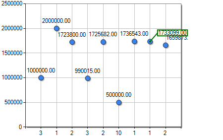 |
| Figure 6: A chart showing the results of the above code used to set its callout line width, anchor cap, and callout style properties. |
Controlling Label Movement
The movement of SmartLabels™ is controlled using the Advanced Properties of the chart's data Series. These properties are all related to the act of moving labels in order to avoid collisions, and as such allow you to define the rules of movement for the label's direction, its distance, and whether or not the data point label is allowed to leave the chart plotting area. It is worthy to note that the labels default movement rules will normally suffice to resolve most issues.
To access the properties discussed here, click Advanced Properties on the chart web part tool bar, and choose Series from the left-hand navigation menu. Under the SmartLabels™ section of the property browser, you will find all of the label-moving properties.
Label-Moving Properties
If the HideOverlapped property is set to True, and the data point label in question cannot be drawn within the region specified by its corresponding MinMovingDistance, and MaxMovingDistance properties, as well as its MovingDirections property, then that data point label will be omitted from the chart display.
MovingDirections Property
The MovingDirections property defines the allowable direction, or directions, in which a data point label is allowed to be moved. This property accepts either a single LabelAlignment value, or multiple bitwise OR LabelAlignment values to indicate that more than one direction of movement is acceptable. The default value for this property is the bitwise OR of all LabelAlignment values, which results in allowing label repositioning to occur in all directions except to the center of the data point itself. Figure 6 shows two charts, one with the moving direction set to Top/Bottom is shown on the left, and the other, shown right, with all moving directions allowed.
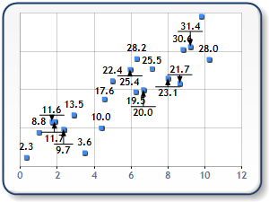 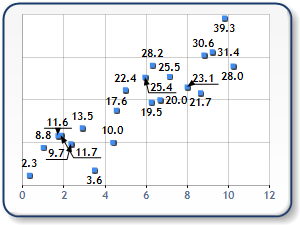 |
| Figure 7: A chart with Top/Bottom moving directions set (shown left), and another with all moving directions set (shown right). |
MinMoving Distance and MaxMovingDistance Property
The MaxMovingDistance property holds a value that specifies the maximum allowable distance from one data point, in pixel units, that a data point label can be moved in order to avoid a labelling collision. This property sets the maximum allowable range of movement for labels which must be repositioned to avoid collisions.
The MinMovingDistance property holds a value that specifies the minimum allowable distance from one data point, in pixel units, that a data point label can be moved in order to avoid a labelling collision. In setting this property it is worthy to note that when a data point label requires repositioning, that label will be moved by the number of pixels specified at the very least. This property sets the minimum allowable range of movement for labels which must be repositioned to avoid collisions.

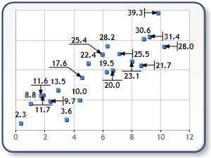
Figure 8: MinMovingDistance set to 0 pixels (shown left) and 10 pixels (shown right)
AllowOutsidePlotArea Property
The AllowOutsidePlotArea property sets a LabelOutsidePlotAreaStyle value that specifies the extent of how the datapoint labels should be drawn with respect to the plotting area. The default value is LabelOutsidePlotAreaStyle.Partial.
When applying the SmartLabels™ functionality, the chart will proceed to draw labels outside of the plotting areas only as a last resort. Normally, the chart will attempt to draw its labels inside of the plotting area, unless the drawing of those labels within the plotting area would result in a labelling collision.
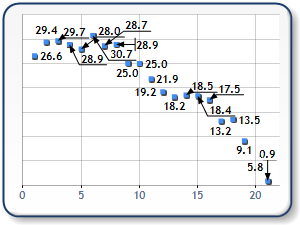
Figure 9: AllowOutsidePlotArea enabled (shown left) and disabled (shown right).
Possible values for the LabelsOutsidePlotAreaStyle enum include the following:
- Yes: Labels are allowed to leave the plotting area if necessary.
- No: Labels are NOT allowed to leave the plotting area.
- Partial: Labels are allowed to leave the plotting area if necessary, but no more than 50% of the label can be drawn outside of the plotting area.
Using Overlapping Properties
HideOverlapped Property
The HideOverlapped property is a Boolean value that specifies whether hiding labels is allowed in the event that an overlapping issue occurs and cannot be resolved.
MarkerOverlapping Property
The MarkerOverlapping property is a boolean value that specifies whether the point labels are allowed to overlap a point marker. By default, this property is set to false to ensure that the labels remain as clear as possible. In cases where the rendered chart has a significant number of data point labels to display, setting the property to true may loosen the rules enough for more point labels to be drawn.
How To
Using Financial Markers


