


Overview

The Range Column chart displays a range of data by plotting two Y values per data point. Each Y value used is drawn as the upper, and lower bounds of a column. This is similar to the Gantt chart with the exception that the columns are positioned vertically. The range between the Y values can be filled with color, information, or even an image.
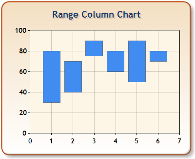
Figure 1: The Range Column chart.
The first Y value is the low value, and the second Y value is the high value of the range.
 Caution Caution |
|---|
| Each data point must consist of two Y values, otherwise an exception is thrown. |
|
Chart Details |
|
|---|---|
|
Number of Y values per point: |
2 |
|
Number of series: |
1 or more. |
|
Support markers: |
No |
|
Cannot be combined with: |
Doughnut, Pie, Bar, Stacked Bar charts, Polar, Radar, Pyramid, or Funnel |
|
Custom Attributes |
|---|
|
DrawSideBySide, DrawingStyle, LabelStyle, EmptyPointValue, ShowMarkerLines |
 See Also
Chart Types
Chart Types Overview