


Overview
A stacked column chart is used to compare the contribution of each value to a total across categories.
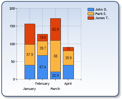
Figure 1: A Stacked Column chart.
 Caution Caution |
|---|
| Stacked series must be aligned, otherwise data points will be rendered incorrectly. For more information on alignment see the topic on Aligning Series. |
|
Chart Details |
|
|---|---|
|
Number of Y values per point: |
1 |
|
Number of series: |
One or more. Multiple series are stacked |
|
Support markers: |
No |
|
Cannot be combined with: |
Doughnut, Pie, Bar, Stacked Bar charts, Polar, Radar, Pyramid, or Funnel |
|
Custom Attributes |
|---|