Pie 2D Chart Specification Sheet
 SWF: Pie2D.swf

Quick Links (within this page)
 Chart  Data  Others
 Chart Image
 Chart Objects
 Functional Attributes
 Titles and Axis Names
 Chart Cosmetics
 Tool-tip
 Paddings and Margins
 Sample XML Data
 <set> element
 Plot Cosmetics
 Pie / Doughnut Properties
 Smart Labels and Lines
 Number Formatting
 Font Properties

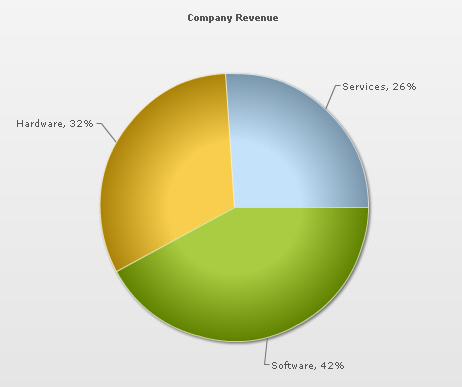
 Pie 2D chart looks as under:
Pie 2D chart

 Sample XML for Pie 2D chart:
<chart caption='Company Revenue' showPercentageValues='1'>
   <set label='Services' value='26' />
   <set label='Hardware' value='32' />
   <set label='Software' value='42' />
</chart>
Back to Top

Chart Objects
Object Name Description Features Supported Animation Parameters Supported
BACKGROUND BACKGROUND refers to the entire background of the chart.
  • Animation
  • Shadow
  • Glow
  • Bevel
  • Blur
  • _alpha
  • _x
  • _y
  • _xScale
  • _yScale
  • CAPTION CAPTION refers to the heading of the chart.
  • Animation
  • Font
  • Shadow
  • Glow
  • Bevel
  • Blur
  • _alpha
  • _x
  • _y
  • DATALABELS DATALABELS refer to the x-axis labels of the data.
  • Font
  • Shadow
  • Glow
  • Bevel
  • Blur
  • DATAPLOT DATAPLOT refers to the actual plot of the chart. For example, in Column 2D chart, columns are referred to as DATAPLOT. In Pie chart, it's the pies. In Bubble chart, it's the bubbles and so on.
  • Animation
  • Shadow
  • Glow
  • Bevel
  • Blur
  • _alpha
  • _rotation
  • SUBCAPTION SUBCAPTION refers to the sub-heading of the chart.
  • Animation
  • Font
  • Shadow
  • Glow
  • Bevel
  • Blur
  • _alpha
  • _x
  • _y
  • TOOLTIP TOOLTIP refers to the tool tip shown when mouse is hovered over the data plots.
  • Font
  • Back to Top

     <chart> element Attributes
    Functional Attributes
    These attributes let you control a variety of functional elements on the chart. For example, you can opt to show/hide data labels, data values, y-axis values. You can also set chart limits and extended properties.

    Attribute Name Type Range Description
    animation Boolean 0/1 This attribute gives you the option to control animation in your charts. If you do not want to animate any part of the chart, set this as 0.
    palette Number 1-5 FusionCharts v3 introduces the concept of Color Palettes. Each chart has 5 pre-defined color palettes which you can choose from. Each palette renders the chart in a different color theme. Valid values are 1-5.
    paletteColors String List of hex color codes separated by comma

    While the palette attribute allows to select a palette theme that applies to chart background, canvas, font and tool-tips, it does not change the colors of data items (i.e., column, line, pie etc.). Using paletteColors attribute, you can specify your custom list of hex colors for the data items. The list of colors have to be separated by comma e.g., <chart paletteColors='FF0000,0372AB,FF5904...'>. The chart will cycle through the list of specified colors and then render the data plot accordingly.

    To use the same set of colors throughout all your charts in a web application, you can store the list of palette colors in your application globally and then provide the same in each chart XML.

    showAboutMenuItem Boolean 0/1 Setting this to 1 shows up a custom context menu in the chart, which can be customized to show your text and can be linked to your URL. For e.g., you can set the context menu of the chart to include "About your company name" and then link to your company home page. By default, the chart shows "About FusionCharts" when right clicked.
    aboutMenuItemLabel String   The menu item label for the custom context menu item.
    aboutMenuItemLink String URL Link for the custom context menu item. You can specify the link in FusionCharts link format to be able to open the same in new window, pop-ups, frames or as JavaScript links.
    showZeroPies Boolean 0/1 Configuration whether to show pies with 0 values (and their values). Otherwise, they won't show up in the chart.
    showPercentValues Boolean 0/1 Whether to show percentage values in labels of the chart.
    showPercentInToolTip Boolean 0/1 Whether to show percentage values in tool tip.
    showLabels Boolean 0/1 Whether to show labels on the chart.
    showValues Boolean 0/1 Whether to show values on the chart.
    labelSepChar String Character The character to separate the data label and data values on the chart.
    defaultAnimation Boolean 0/1 By default, each chart animates some of its elements. If you wish to switch off the default animation patterns, you can set this attribute to 0. It can be particularly useful when you want to define your own animation patterns using STYLE feature.
    clickURL String The entire chart can now act as a hotspot. Use this URL to define the hotspot link for the chart. The link can be specified in FusionCharts Link Format.
    Back to Top


    Chart Titles and Axis Names
    Using these attributes, you can set the various headings and titles of chart like caption, sub-caption, x-axis and y-axis names etc.

    Attribute Name Type Description
    caption String Caption of the chart.
    subCaption String Sub-caption of the chart.
    Back to Top


    Chart Cosmetics
    The following attributes let you configure chart cosmetics like background color, background alpha, canvas color & alpha etc.

    Attribute Name Type Range Description
    showBorder Boolean 0/1 Whether to show a border around the chart or not.
    borderColor Color Border color of the chart.
    borderThickness Number In Pixels Border thickness of the chart.
    borderAlpha Number 0-100 Border alpha of the chart.
    bgColor Color This attribute sets the background color for the chart. You can set any hex color code as the value of this attribute. To specify a gradient as background color, separate the hex color codes of each color in the gradient using comma. Example: FF5904,FFFFFF. Remember to remove # and any spaces in between. See the gradient specification page for more details.
    bgAlpha Number 0-100 Sets the alpha (transparency) for the background. If you've opted for gradient background, you need to set a list of alpha(s) separated by comma. See the gradient specification page for more details.
    bgRatio Number 0-100 If you've opted for a gradient background, this attribute lets you set the ratio of each color constituent. See the gradient specification page for more details.
    bgAngle Number 0-360 Angle of the background color, in case of a gradient. See the gradient specification page for more details.
    bgSWF String To place any Flash movie as background of the chart, enter the (path and) name of the background SWF. It should be in the same domain as the chart.
    bgSWFAlpha Number 0-100 Helps you specify alpha for the loaded background SWF.
    showVLineLabelBorder Boolean 0/1 If you've opted to show a label for any of your vLines in the chart, you can collectively configure whether to show border for all such labels using this attribute. If you want to show label border for just a particular vLine, you can over-ride this value by specifying border configuration for that specific vLine.
    logoURL String URL You can load an external logo (JPEG/PNG/SWF) on the chart once it has rendered. This attribute lets you specify the URL of the same. Owing to Flash Player security settings, you can only specify logo that are on the sub-domain as the SWF file of the chart.
    logoPosition String TL, TR, BL, BR, CC

    Where to position the logo on the chart:

    • TL - Top-left
    • TR - Top-right
    • BR - Bottom right
    • BL - Bottom left
    • CC - Center of screen
    logoAlpha Number 0-100 Once the logo has loaded on the chart, you can configure its opacity using this atribute.
    logoScale Number 0-300 You can also change the scale of externally loaded logo at run-time by specifying a value for this parameter.
    logoLink String URL If you want to link the logo to an external URL, specify the link in this attribute. The link can be in FusionCharts link format, allowing you to link to new windows, pop-ups, frames etc.
    Back to Top


    Data Plot Cosmetics
    These attributes let you configure how your plot (colums, lines, area, pie or any data that you're plotting) would appear on the chart.

    If the plots can show borders, you can control the border properties using the attributes listed below. Or, if they support gradient fills, you can again configure various properties of the gradient using these attributes.

    Various other controls over plot cosmetics can be attained using this set of attributes.

    Attribute Name Type Range Description
    showPlotBorder Boolean 0/1 Whether the column, area, pie etc. border would show up.
    plotBorderColor Color Color for column, area, pie border
    plotBorderThickness Number 0-5 (Pixels) Thickness for column, area, pie border
    plotBorderAlpha Number 0-100 Alpha for column, area, pie border
    plotFillAlpha Number 0-100 This attribute lets you set the fill alpha for plot.
    showShadow Boolean 0/1 Whether to show shadow for pie/doughnuts.
    use3DLighting Boolean 0/1 Whether to use advanced gradients and shadow effects to create better looking 3D charts.
    Back to Top


    Pie / Doughnut Properties
    The following attributes let you control various functionalities of pie/doughnut chart.

    Attribute Name Type Range Description
    radius3D Number In Percent You can define the 3D Radius of chart in percentage using this attribute. It basically helps you set the bevel distance for the pie/doughnut (if in 3D Lighting Mode).
    slicingDistance Number In Pixels If you've opted to slice a particular pie/doughnut slice, using this attribute you can control the distance between the slice and the center of chart.
    pieRadius Number In Pixels This attribute lets you explicitly set the outer radius of the chart. FusionCharts automatically calculates the best fit pie radius for the chart. This attribute is useful if you want to enforce one of your own values.
    startingAngle Number 0-360 By default, the pie chart starts from angle 0 i.e., the first pie starts plotting from 0 angle. If you want to change the starting angle of the chart, use this attribute.
    enableRotation Boolean 0/1 The doughnut/pie charts have three modes: Slicing, Rotation and Link. If any links are defined, the chart works in Link mode. Otherwise, it starts in Slicing mode. If you need to enable rotation by default, set this attribute to 1.
    Back to Top


    Smart Lines & Labels
    Starting FusionCharts v3, the pie and doughnut charts can now have smart labels and lines.

    Smart labels/lines are data connector lines which connect the pie/doughnut slices to their respective labels without over-lapping even in cases where there are lots of labels located near each other.

    You can configure the smart labels/lines properties using the attributes below.

    Attribute Name Type Range Description
    enableSmartLabels Boolean 0/1 Whether to use smart labels or not.
    skipOverlapLabels Boolean 0/1 Whether to skip labels that are overlapping even when using smart labels. If not, they might overlap if there are too many labels.
    isSmartLineSlanted Boolean 0/1 The smart lines (smart label connector lines) can appear in two ways: Slanted or Straight. This attribute lets you choose between them.
    smartLineColor Color Hex Code Color of smart label connector lines.
    smartLineThickness Number In Pixels Thickness of smart label connector lines.
    smartLineAlpha Number 0-100 Alpha of smart label connector lines.
    labelDistance Number In Pixels This attribute helps you set the distance of the label/value text boxes from the pie/doughnut edge.
    smartLabelClearance Number In Pixels Clearance distance of a label (for sliced-in pies) from an adjacent sliced out pies.
    Back to Top


    Number Formatting
    FusionCharts v3 offers you a lot of options to format your numbers on the chart.

    Using the attributes below, you can control a myriad of options like:
  • Formatting of commas and decimals
  • Number prefixes and suffixes
  • Decimal places to which the numbers would round to
  • Scaling of numbers based on a user defined scale
  • Custom number input formats

  • Attribute Name Type Range Description
    formatNumber Boolean 0/1 This configuration determines whether the numbers displayed on the chart will be formatted using commas, e.g., 40,000 if formatNumber='1' and 40000 if formatNumber='0 '
    formatNumberScale Boolean 0/1 Configuration whether to add K (thousands) and M (millions) to a number after truncating and rounding it - e.g., if formatNumberScale is set to 1, 1043 would become 1.04K (with decimals set to 2 places). Same with numbers in millions - a M will added at the end. For more details, please see Advanced Number Formatting section.
    defaultNumberScale String The default unit of the numbers that you're providing to the chart. For more details, please see Advanced Number Formatting section.
    numberScaleUnit String Unit of each block of the scale. For more details, please see Advanced Number Formatting section.
    numberScaleValue String Range of the various blocks that constitute the scale. For more details, please see Advanced Number Formatting section.
    numberPrefix String Character Using this attribute, you could add prefix to all the numbers visible on the graph. For example, to represent all dollars figure on the chart, you could specify this attribute to ' $' to show like $40000, $50000. For more details, please see Advanced Number Formatting section.
    numberSuffix String Character Using this attribute, you could add a suffix to all the numbers visible on the graph. For example, to represent all figure quantified as per annum on the chart, you could specify this attribute to ' /a' to show like 40000/a, 50000/a. For more details, please see Advanced Number Formatting section.
    decimalSeparator String Character This option helps you specify the character to be used as the decimal separator in a number. For more details, please see Advanced Number Formatting section.
    thousandSeparator String Character This option helps you specify the character to be used as the thousands separator in a number. For more details, please see Advanced Number Formatting section.
    inDecimalSeparator String Character In some countries, commas are used as decimal separators and dots as thousand separators. In XML, if you specify such values, it will give a error while converting to number. So, FusionCharts accepts the input decimal and thousand separator from user, so that it can covert it accordingly into the required format. This attribute lets you input the decimal separator. For more details, please see Advanced Number Formatting section.
    inThousandSeparator String Character In some countries, commas are used as decimal separators and dots as thousand separators. In XML, if you specify such values, it will give a error while converting to number. So, FusionCharts accepts the input decimal and thousand separator from user, so that it can covert it accordingly into the required format. This attribute lets you input the thousand separator. For more details, please see Advanced Number Formatting section.
    decimals Number 0-10 Number of decimal places to which all numbers on the chart would be rounded to.
    forceDecimals Boolean 0-1 Whether to add 0 padding at the end of decimal numbers. For example, if you set decimals as 2 and a number is 23.4. If forceDecimals is set to 1, FusionCharts will convert the number to 23.40 (note the extra 0 at the end)
    Back to Top


    Font Properties
    Using the attributes below, you can define the generic font properties for all the text on the chart. These attributes allow you a high level control over font properties.

    If you intend to specify font properties for individual chart elements (like Caption, sub-caption etc.), you'll need to use the STYLES feature of FusionCharts v3. Using STYLES, you can also specify advanced font properties like Bold, Italics, HTML Mode etc.

    Attribute Name Type Range Description
    baseFont String Font Name This attribute lets you set the font face (family) of all the text (data labels, values etc.) on chart. If you specify outCnvBaseFont attribute also, then this attribute controls only the font face of text within the chart canvas bounds.
    baseFontSize Number 0-72 This attribute sets the base font size of the chart i.e., all the values and the names in the chart which lie on the canvas will be displayed using the font size provided here.
    baseFontColor Color This attribute sets the base font color of the chart i.e., all the values and the names in the chart which lie on the canvas will be displayed using the font color provided here.
    Back to Top


    Tool-tip
    These attributes let you control the tool tip. You can set the background color, border color, separator character and few other details.

    Attribute Name Type Range Description
    showToolTip Boolean 0/1 Whether to show tool tip on chart.
    toolTipBgColor Color Background Color for tool tip.
    toolTipBorderColor Color Border Color for tool tip.
    toolTipSepChar String The character specified as the value of this attribute separates the name and value displayed in tool tip.
    showToolTipShadow Boolean 0/1 Whether to show shadow for tool-tips on the chart.
    Back to Top


    Chart Padding & Margins
    The following attributes help you control chart margins and paddings.

    FusionCharts v3 allows you manually customize the padding of various elements on the chart to allow advanced manipulation and control over chart visualization. Padding in FusionCharts is always defined in pixels, unless the attribute itself suggests some other scale (like plotSpacePercent).

    You can also define the chart margins. Chart Margins refer to the empty space left on the top, bottom, left and right of the chart. That means, FusionCharts wouldn't plot anything in that space.

    It's not necessary for you to specify any padding/margin values. FusionCharts automatically assumes the best values for the same, if you do not specify the same.

    Attribute Name Type Range Description
    captionPadding Number In Pixels This attribute lets you control the space (in pixels) between the sub-caption and top of the chart canvas. If the sub-caption is not defined, it controls the space between caption and top of chart canvas. If neither caption, nor sub-caption is defined, this padding does not come into play.
    chartLeftMargin Number In Pixels Amount of empty space that you want to put on the left side of your chart. Nothing is rendered in this space.
    chartRightMargin Number In Pixels Amount of empty space that you want to put on the right side of your chart. Nothing is rendered in this space.
    chartTopMargin Number In Pixels Amount of empty space that you want to put on the top of your chart. Nothing is rendered in this space.
    chartBottomMargin Number In Pixels Amount of empty space that you want to put on the bottom of your chart. Nothing is rendered in this space.
    Back to Top


    <set> element
    Each <set> element (child of <chart> or <dataset> element) represents a set of data which is to be plotted on the graph and determines a set of data which would appear on the chart.

    For a single series chart, a typical <set> element would look like:
    <set label='January' value='17400' />

    For a multi-series chart, it could look like:
    <dataset seriesName='2006'>
    <set value='35445' />
    <set value='35675' />
    .... and so on ....
    </dataset>


    In multi-series/combination charts, you should again note that the number of <category> elements should be equal to the number of data points in each data sets, i.e., if you mention twelve categories (twelve months), the data for both years (2005 & 2006) should also contain twelve <set> elements (twelve rows of data).

    Attribute Name Type Range Description
    borderColor Color Hex Code If you want to set border color of individual pie/doughnut data items, you can specify using this attribute.
    borderAlpha Color Hex Code If you want to set border alpha of individual pie/doughnut data items, you can specify using this attribute.
    isSliced Boolean 0/1 This attribute determines whether the pie appears as a part of the total chart or is sliced out as an individual item.
    label String This attribute determines the label for the data item. The label appears on the x-axis of chart.
    value Number Numerical value for the data item. This value would be plotted on the chart.
    displayValue String   If instead of the numerical value of this data, you wish to display a custom string value, you can specify the same here. Examples are annotation for a data item etc.
    color Color Hex Code If you want to define your own colors for the data items on chart, use this attribute to specify color for the data item. This attribute accepts hex color codes without #.
    link String You can define links for individual data items. That enables the end user to click on data items (columns, lines, bars etc.) and drill down to other pages. To define the link for data items, use the link attribute. You can define links that open in same window, new window, pop-up window or frames. Please see "Advanced Charting > Drill Down Charts" for more information. Also, you'll need to URL Encode all the special characters (like ? and &) present in the link.
    toolText String By default, FusionCharts shows the data item name and value as tool tip text for that data item. But, if you want to display more information for the data item as tool tip, you can use this attribute to specify the same.
    dashed Boolean 0/1 Whether the border of this data item should appear as dashed. This is particularly useful when you want to highlight a data (such as forecast or trend etc.).
    alpha Number 0-100 This attribute determines the transparency of a data item. The range for this attribute is 0 to 100. 0 means complete transparency (the data item won’t be shown on the graph) and 100 means opaque.
    Back to Top