Multi-level Pie Chart Specification Sheet
 SWF: MultiLevelPie.swf

Quick Links (within this page)
 Chart  Data  Others
 Chart Image
 Chart Objects
 Functional Attributes
 Titles and Axis Names
 Chart Cosmetics
 Tool-tip
 Paddings and Margins
 Sample XML Data
 <category> element
 Plot Cosmetics
 Pie / Doughnut Properties
 Number Formatting
 Font Properties

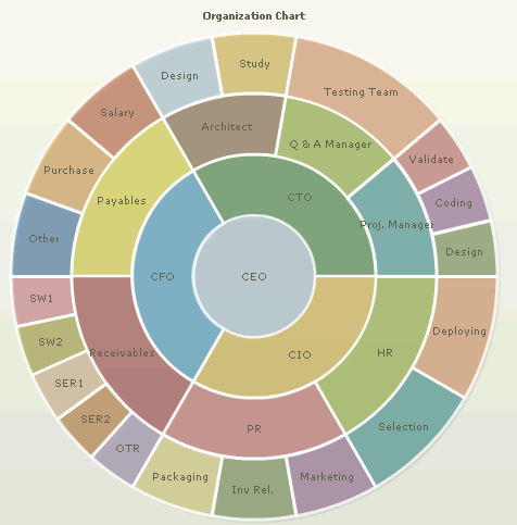
 Multi-level Pie chart looks as under:
Multi-level Pie chart

 Sample XML for Multi-level Pie chart:

<chart palette='2' piefillAlpha='34' pieBorderThickness='3' hoverFillColor='FDCEDA' pieBorderColor='FFFFFF' baseFontSize='9' useHoverColor='1' caption='Organization Chart' >
   <category label='CEO' fillColor='DBFF6C' link='n-Details.asp?CEO'>
      <category label='CTO' fillColor='DBFF6C'>
         <category label='Proj. Manager' >
            <category label='Design' />
            <category label='Coding' />
            <category label='Validate' />
         </category>
         <category label='Q & A Manager' >
            <category label='Testing Team' />
         </category>
         <category label='Architect' >
            <category label='Study' />
            <category label='Design' />
         </category>
      </category>
   <category label='CFO' fillColor='FBE299' >
      <category label='Payables' hoverText='Accounts Payable Team'>
         <category label='Salary' hoverText='Team for salary accounts maintenance and upkeep' />
         <category label='Purchase' />
         <category label='Other' hoverText='Other Payments' />
      </category>
      <category label='Receivables' hoverText='Accounts Receivables Team'>
         <category label='SW1' hoverText='Online Software Receipts Accounts' />
         <category label='SW2' hoverText='Physical Software Receipts Accounts' />
         <category label='SER1' hoverText='Services Collection' />
         <category label='SER2' hoverText='Services Collection (Physical)' />
         <category label='OTR' hoverText='Subscription and Other Collections' />
      </category>
   </category>
   <category label='CIO' fillColor='DAEDFC' link='Details.asp?CIO'>
      <category label='PR' hoverText='PR Team'>
         <category label='Packaging' hoverText='Packaging Staff' />
         <category label='Inv Rel.' hoverText='Investor Relations Upkeep' />
         <category label='Marketing' hoverText='Marketing & Sales' />
      </category>
      <category label='HR' hoverText='HR Team'>
         <category label='Selection' hoverText='Selection of Candidates' />
         <category label='Deploying' hoverText='Deploying at required site' />
      </category>
   </category>
</category>
<styles>
   <definition>
      <style name='myHTMLFont' type='font' isHTML='1' />
   </definition>
   <application>
      <apply toObject='TOOLTIP' styles='myHTMLFont' />
   </application>
</styles>
</chart>

Back to Top

Chart Objects
Object Name Description Features Supported Animation Parameters Supported
BACKGROUND BACKGROUND refers to the entire background of the chart.
  • Animation
  • Shadow
  • Glow
  • Bevel
  • Blur
  • _alpha
  • _x
  • _y
  • _xScale
  • _yScale
  • CAPTION CAPTION refers to the heading of the chart.
  • Animation
  • Font
  • Shadow
  • Glow
  • Bevel
  • Blur
  • _alpha
  • _x
  • _y
  • DATALABELS DATALABELS refer to the x-axis labels of the data.
  • Animation
  • Font
  • Shadow
  • Glow
  • Bevel
  • Blur
  • _alpha
  • _x
  • _y
  • DATAPLOT DATAPLOT refers to the actual plot of the chart. For example, in Column 2D chart, columns are referred to as DATAPLOT. In Pie chart, it's the pies. In Bubble chart, it's the bubbles and so on.
  • Animation
  • Shadow
  • Glow
  • Bevel
  • Blur
  • _alpha
  • _x
  • _y
  • _xScale
  • _yScale
  • SUBCAPTION SUBCAPTION refers to the sub-heading of the chart.
  • Animation
  • Font
  • Shadow
  • Glow
  • Bevel
  • Blur
  • _alpha
  • _x
  • _y
  • TOOLTIP TOOLTIP refers to the tool tip shown when mouse is hovered over the data plots.
  • Font
  • Back to Top

     <chart> element Attributes
    Functional Attributes
    These attributes let you control a variety of functional elements on the chart.

    Attribute Name Type Range Description
    animation Boolean 0/1 This attribute lets you set the configuration whether the chart should appear in an animated fashion. If you do not want to animate any part of the chart, set this as 0.
    palette Number 1-5 FusionCharts v3 introduces the concept of Color Palettes. Each chart has 5 pre-defined color palettes which you can choose from. Each palette renders the chart in a different color theme. Valid values are 1-5.
    clickURL String The entire chart can now act as a hotspot. Use this URL to define the hotspot link for the chart. The link can be specified in FusionCharts Link Format.
    defaultAnimation Boolean 0/1 By default, each chart animates some of its elements. If you wish to switch off the default animation patterns, you can set this attribute to 0. It can be particularly useful when you want to define your own animation patterns using STYLE feature.
    paletteColors String List of hex color codes separated by comma

    While the palette attribute allows to select a palette theme that applies to chart background, canvas, font and tool-tips, it does not change the colors of data items (i.e., column, line, pie etc.). Using paletteColors attribute, you can specify your custom list of hex colors for the data items. The list of colors have to be separated by comma e.g., <chart paletteColors='FF0000,0372AB,FF5904...'>. The chart will cycle through the list of specified colors and then render the data plot accordingly.

    To use the same set of colors throughout all your charts in a web application, you can store the list of palette colors in your application globally and then provide the same in each chart XML.

    showAboutMenuItem Boolean 0/1 Setting this to 1 shows up a custom context menu in the chart, which can be customized to show your text and can be linked to your URL. For e.g., you can set the context menu of the chart to include "About your company name" and then link to your company home page. By default, the chart shows "About FusionCharts" when right clicked.
    aboutMenuItemLabel String   The menu item label for the custom context menu item.
    aboutMenuItemLink String URL Link for the custom context menu item. You can specify the link in FusionCharts link format to be able to open the same in new window, pop-ups, frames or as JavaScript links.
    showLabels Boolean 0/1 Whether to show labels on the chart?
    Back to Top


    Chart Titles and Axis Names
    Using these attributes, you can set the caption & sub-caption of the chart.

    Attribute Name Type Description
    caption String Caption of the chart.
    subCaption String Sub-caption of the chart.
    Back to Top


    Chart Cosmetics
    The following attributes let you configure chart cosmetics like background color, background alpha etc.

    Attribute Name Type Range Description
    showBorder Boolean 0/1 Whether to show a border around the chart or not?
    borderColor Color Border color of the chart.
    borderThickness Number In Pixels Border thickness of the chart.
    borderAlpha Number 0-100 Border alpha of the chart.
    bgColor Color This attribute sets the background color for the chart. You can set any hex color code as the value of this attribute. To specify a gradient as background color, separate the hex color codes of each color in the gradient using comma. Example: FF5904,FFFFFF. Remember to remove # and any spaces in between. See the gradient specification page for more details.
    bgAlpha Number 0-100 Sets the alpha (transparency) for the background. If you've opted for gradient background, you need to set a list of alpha(s) separated by comma. See the gradient specification page for more details.
    bgRatio Number 0-100 If you've opted for a gradient background, this attribute lets you set the ratio of each color constituent. See the gradient specification page for more details.
    bgAngle Number 0-360 Angle of the background color, in case of a gradient. See the gradient specification page for more details.
    bgSWF String To place any Flash movie as background of the chart, enter the (path and) name of the background SWF. It should be in the same domain as the chart.
    bgSWFAlpha Number 0-100 Helps you specify alpha for the loaded background SWF.
    logoURL String URL You can load an external logo (JPEG/PNG/SWF) on the chart once it has rendered. This attribute lets you specify the URL of the same. Owing to Flash Player security settings, you can only specify logo that are on the sub-domain as the SWF file of the chart.
    logoPosition String TL, TR, BL, BR, CC

    Where to position the logo on the chart:

    • TL - Top-left
    • TR - Top-right
    • BR - Bottom right
    • BL - Bottom left
    • CC - Center of screen
    logoAlpha Number 0-100 Once the logo has loaded on the chart, you can configure its opacity using this atribute.
    logoScale Number 0-300 You can also change the scale of externally loaded logo at run-time by specifying a value for this parameter.
    logoLink String URL If you want to link the logo to an external URL, specify the link in this attribute. The link can be in FusionCharts link format, allowing you to link to new windows, pop-ups, frames etc.
    Back to Top


    Data Plot Cosmetics
    These attributes let you configure how your plot would appear on the chart.

    Attribute Name Type Range Description
    showPlotBorder Boolean 0/1 Whether the pie border would show up.
    plotBorderColor Color Color for pie border
    plotBorderThickness Number 0-5 (Pixels) Thickness for pie border
    plotBorderAlpha Number 0-100 Alpha for pie border
    plotFillAlpha Number 0-100 This attribute lets you set the fill alpha for plot.
    showShadow Boolean 0/1 Whether to show shadow for pie?
    plotFillColor Color Hex Code Fill color for all the pies.
    Back to Top


    Pie / Doughnut Properties
    The following attributes let you control various functionalities of pie.

    Attribute Name Type Range Description
    pieRadius Number In Pixels This attribute lets you explicitly set the outer radius of the chart. FusionCharts automatically calculates the best fit pie radius for the chart. This attribute is useful if you want to enforce one of your own values.
    Back to Top


    Number Formatting
     

    Attribute Name Type Range Description
    inDecimalSeparator String Character In some countries, commas are used as decimal separators and dots as thousand separators. In XML, if you specify such values, it will give a error while converting to number. So, FusionCharts accepts the input decimal and thousand separator from user, so that it can covert it accordingly into the required format. This attribute lets you input the decimal separator. For more details, please see Advanced Number Formatting section.
    inThousandSeparator String Character In some countries, commas are used as decimal separators and dots as thousand separators. In XML, if you specify such values, it will give a error while converting to number. So, FusionCharts accepts the input decimal and thousand separator from user, so that it can covert it accordingly into the required format. This attribute lets you input the thousand separator. For more details, please see Advanced Number Formatting section.
    Back to Top


    Font Properties
    Using the attributes below, you can define the generic font properties for all the text on the chart. These attributes allow you a high level control over font properties.

    If you intend to specify font properties for individual chart elements (like Caption, sub-caption etc.), you'll need to use the STYLES feature of FusionCharts v3. Using STYLES, you can also specify advanced font properties like Bold, Italics, HTML Mode etc.

    Attribute Name Type Range Description
    baseFont String Font Name This attribute lets you set the font face (family) of all the text (data labels, values etc.) on chart. If you specify outCnvBaseFont attribute also, then this attribute controls only the font face of text within the chart canvas bounds.
    baseFontSize Number 0-72 This attribute sets the base font size of the chart i.e., all the values and the names in the chart which lie on the canvas will be displayed using the font size provided here.
    baseFontColor Color This attribute sets the base font color of the chart i.e., all the values and the names in the chart which lie on the canvas will be displayed using the font color provided here.
    Back to Top


    Tool-tip
    These attributes let you control the tool tip. You can set the background color, border color, separator character and few other details.

    Attribute Name Type Range Description
    showToolTip Boolean 0/1 Whether to show tool tip on chart?
    toolTipBgColor Color Background Color for tool tip.
    toolTipBorderColor Color Border Color for tool tip.
    toolTipSepChar String The character specified as the value of this attribute separates the name and value displayed in tool tip.
    useHoverColor Boolean 0/1 Whether to use the hover fill color for the pies?
    hoverFillColor Color Hex Code The color which should be used as fill during hover.
    showToolTipShadow Boolean 0/1 Whether to show shadow for tool-tips on the chart.
    Back to Top


    Chart Padding & Margins
    The following attributes help you control chart margins and paddings.

    Attribute Name Type Range Description
    captionPadding Number In Pixels This attribute lets you control the space (in pixels) between the sub-caption and top of the chart canvas. If the sub-caption is not defined, it controls the space between caption and top of chart canvas. If neither caption, nor sub-caption is defined, this padding does not come into play.
    chartLeftMargin Number In Pixels Amount of empty space that you want to put on the left side of your chart. Nothing is rendered in this space.
    chartRightMargin Number In Pixels Amount of empty space that you want to put on the right side of your chart. Nothing is rendered in this space.
    chartTopMargin Number In Pixels Amount of empty space that you want to put on the top of your chart. Nothing is rendered in this space.
    chartBottomMargin Number In Pixels Amount of empty space that you want to put on the bottom of your chart. Nothing is rendered in this space.
    Back to Top


    <category> element
    Each <category> element represents a pie. You can specify the following attributes for <category> element:

    Attribute Name Type Range Description
    label String Display value for the pie.
    value Number Numeric Value

    If you do not want a symmetrical distribution for all the pies, you can allot numeric values to individual pies. This can be done using the value attribute of each category. You'll need to define the value for all the categories (pies) then. The sweep angle of the pie would depend on its value.

    If you just want a symmetrical multi-level pie chart, you can ignore the value.

    Color Color Hex Code Color for the pie.
    Alpha Number 0-100 Alpha for the pie.
    hoverText String Tool text for the pie.
    link String Link for the pie.
    Back to Top