


Overview

Commands are the means to interact with user-interface elements. Each command contains a chart function that you can utilize to build your own customized toolbar, context menu, or both. Each command can be added as an item in the CommandUIItem collection. Commands are displayed as buttons contained in the toolbar, and menu items contained in the context menu.
All commands can have one or more sub-commands. The SubCommands collection is a collection of Command objects. As an example, the LoadGroup command has four sub-commands by default:
- Load Appearance.
- Load All.
- Separator.
- Reset Appearance.
Types of Commands
Standard commands are provided for more than 100 common chart tasks, including 2D/3D toggling, chart type selection, 3D rotation, and more.
User-defined commands allow you to extend existing commands, or to create your own commands. Any command (or sub-command) can have user-defined functionality. As part of the chart UI, events are fired to allow you to provide user-defined customized functionality.
Visual Attributes
The Description property defines a textual description of the command that will be displayed as a tooltip in the toolbar. There is also a Text property, that is used to define the text of the command as it will appear in the context menu. These properties should both be set if you wish to display a command on both the toolbar and context menu.
Behavior
By default, each command contains built-in logic that determines the initial behavior of the command. However, this behavior can also be controlled by using several properties.
Showing and Hiding Commands
When the Enabled property is set to False, the command will appear in the toolbar as a grayed out item. When the Visible property is set to False, the command will not appear in the toolbar and context menu.
Display Styles
The PopupStyle property is used when a group of items is displayed on the UI. If PopupStyle is set to Menu, the UI will display the command as a menu item, with text, and an adjacent icon. If PopupStyle is set to Table, the UI will display the command as an icon within a table.
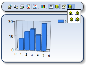
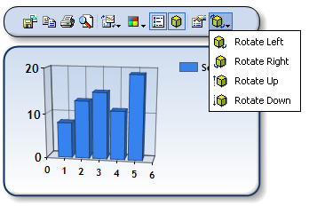
Figure 1: PopupStyle=Table (shown left), and PopupStyle=Menu (shown right).
Toggling
Toggling behaviors are most commonly defined to reflect different states of the chart. The Toggled property is simply a Boolean value that sets toggling on or off. The ToggleStyle property will further define the toggling behavior of the command. Its possible values are:
- Auto: The Chart will determine the toggling behavior of the command.
- Toggled: The command will toggle as a simple, two-state, "on-or-off" button.
- Grouped: The command will use its ToggleGroupID to determine the toggled commands that are within the group. The commands in the group will behave as items in a radio button list.
The ToggleStyle, ToggleGroupID, and Toggled properties all work in concert with each other. The default value of ToggleGroupID is zero, and this ID will work with other grouped commands that use this group ID. However, if other toggle groups are used, then the ToggleGroupID must be unique for each group.
Example
This example demonstrates how to add a toggled group of commands. This will allow the user to switch between a Line, Spline and StepLine chart type, simulating a radio button list, on the toolbar.
| Visual Basic |  Copy Code Copy Code |
|---|---|
| |
| C# | Copy Code |
|---|---|
| |
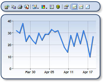
Figure 2: The last three toolbar commands as a toggled group.
Parameters
Command parameters are a set of comma-separated values that are used to customize existing commands, or create custom commands. You will need to refer to the Command Parameter List for a list of all commands, and their accepted parameters.
When using parameters in conjunction with formulas on the UI, the Params property of a command defines parameters that are unique to each formula. Formula parameters are generally used to specify time periods for calculations.
For more information on how to work with formula parameters, see the topic on Using Financial Formulas.
Customizing
You can customize commands on the toolbar or context menu in one of two ways, either:
- By modifying a pre-defined chart command. This can be done by setting the CommandType to the desired command.
- By adding a user-defined command.
Each customized command is automatically assigned a CommandID that you can use to identify the command when handling its events. To add a customized command to the UI, follow these steps:
- Add a new item to the Command collection.
- Set the appearance, and behavior of this user-defined command.
- Create a handler for the CommandFiredArgs to achieve the desired behavior for the command.
Example
This example demonstrates how to create a custom command and define its behavior when selected.
| Visual Basic | Copy Code |
|---|---|
| |
| C# | Copy Code |
|---|---|
| |
Limitations
The UseLastSubCommand, and AllowMouseMoving properties, as well as the AddAnnotation commands, are no longer supported in Dundas Chart for ASP.NET.