


Overview
The Box Plot chart type consists of one or more box symbols that summarize the distribution of the data within one or more data sets. A Box Chart displays a rectangle with whisker lines extending from both ends. What makes a Box Plot unique, in comparison to standard chart types, is that the values for a box plot most often are calculated values from data that is present in another series. One box symbol, or data point, is associated with one data series. The data for a Box Plot series may still be populated using data binding, or by employing the Points Collection.
Box Plot Values
A Box Plot series uses at least 6 Y values. However, additional Y values may be added and plotted as markers (known as unusual points). The ordering of the points is important because each value represents a value on the chart.
|
Y Values Index |
Y Value |
|
0 |
Lower whisker |
|
1 |
Upper whisker |
|
2 |
Lower box |
|
3 |
Upper box |
|
4 |
Average / mean |
|
5 |
Median |
|
>=6 |
Other Unusual points shown as markers Average or Median Y values can be hidden if set to double.NaN |
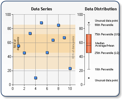
Figure 1: A Box Plot chart.
Median and Average box lines are drawn by default, but can be hidden using BoxPlotShowMedian, and BoxPlotShowAverage custom attributes. These values can be set to either true or false.
All standard markers styles can be used with the box chart by using the MarkerStyle property. When markers are not set, which is their default behavior, horizontal lines will be displayed similar to the stock chart. The Box Plot appearance can also be altered by use of the PointWidth custom attribute. This attribute will vary the width of the box portion of the Box Plot.
Calculated Box Plot Values
A custom attribute, BoxPlotSeries , is used to attach the box chart type to one or more existing series (by name) which to be used for calculations. This attribute can be set for the entire series or for each individual data points of the box chart. When set to the series, the BoxPlotSeries contains one or more semi-colon separated series names. As a result each Box Plot point values will be calculated and added for each series specified in the BoxPlotSeries attribute.
If BoxPlotSeries custom attribute is set in a data point object only, then only one series can be specified. The First Y value of the series will be used by default. Optionally, with the name of the series, the user can specify which value to use.
By default, the upper and lower box values are calculated using the 25th/75th percentile. The Whisker values are calculated using the 10th/90th percentile. This behavior can be changed using the BoxPlotPercentile and BoxPlotWhiskerPercentile attributes.
Optionally, values from the original data series that are outside of the whisker values can be added as individual values to the box plot. To enable this feature the BoxPlotShowUnusualValues attribute must be set to true in the manner shown below.
|
Chart Details |
|
|
Number of Y values per point: |
6 or more |
|
Number of series: |
One |
|
Support markers: |
No |
|
Cannot be combined with: |
Doughnut, Pie, Bar |
|
Custom Attributes |
|
|
BoxPlotShowMedian, BoxPlotShowAverage, PointWidth, BoxPlotSeries, BoxPlotPercentile, BoxPlotWiskerPercentile, BoxPlotShowUnusualValues |
 See Also
Chart Types
Chart Types Overview