


Overview
Drilldown, or selection, is a process where a user clicks on a chart element, and some sort of action is taken depending on what the user clicked. Drilldown is the practical application of the selection process where a sub-set of data is displayed as a result of the user having clicked on a chart element, like a data point or legend item. Drilldown is implemented using a complement of filter web parts, SQL queries, and the functionalities found in the Interactive Features tab in step 3 of the Customization Wizard.
Understanding Drilldown
To implement drilldown, a brief understanding of what is actually happening within the charting web part, or more correctly charting web parts, may be very helpful. It may not be completely obvious to the casual observer, but drilling down into data is really a matter of applying a filter, with specific parameters, to the data being clicked, then displaying the results. By focusing the data results returned by filters with each subsequent click of the mouse, the charting web part can be made to explore data in a very intuitive manner known as drilling down.
The component pieces of the implementation puzzle for the drilldown functionality include the use of several web parts including:
- A data source that supports the use of SQL queries, like an Excel spreadsheet.
- A Query String (URL) Filter.
- A chart that the user clicks.
- A chart showing the results of the user's click.
It is worthy to note that drilldown can be implemented in many ways, and the results of a user's click need not be shown in a second chart as we will do here. Drilldown can be implemented so that when the user clicks on a chart element, that chart itself can display the results, or perhaps that chart could bring up a completely new page. In effect, when a drilldown click results in jumping to a new page, this could be considered drill-through more than drilldown. For simplicity, we have purposely chosen to use a two chart implementation where one chart, a pie chart in this case, is the chart that gets clicked, and the other chart, a column chart, displays the results. Both of these charts are shown in Figure 1 below.
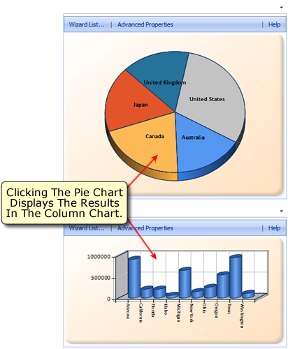 |
| Figure 1: The Pie chart gets clicked, and the results are shown in the Column chart below it. |
Implementing Drilldown
Create The Data Source
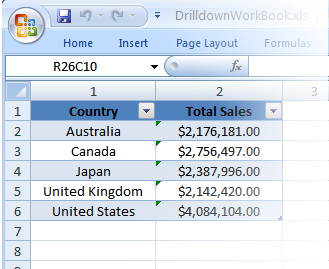
The first step in our drilldown example is to create an Excel workbook project that will contain 2 spreadsheets. This Excel workbook, saved as an xls file, will act as the data source for our two charts. Within the Excel workbook we will create 2 spreadsheets, just like the ones shown in Figure 2 below.
 |
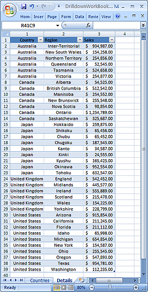 |
| Figure 2: Two Excel spreadsheets used as our example's datasource. One spreadsheet is called Countries (shown left), and the other is called Details (shown right). | |
Create A New Project And Add Two Charts
The next step is to create a SharePoint project, and add two chart web parts to it. The first web part will be a Pie chart, and the second is a Column chart. Figure 1 above shows the two charts. The idea here is to have the user click on a country in the Pie chart, and have that country's sales data display in the Column chart immediately below it. Therefore, the Pie chart will use the spreadsheet called Countries, and the Column chart will use the spreadsheet called Details to get their individual data.
Connect The Two Charts To The Datasource
In this step we will connect our charts to the Excel workbook file so they can use it as their datasource. This will require us to use the Data Connection Wizard along with some SQL statements to get the data from our Excel spreadsheets into our charts as required. Open the Data Connection Wizard and follow these steps to connect each of the above charts to their own spreadsheet in our Excel datasource:
- Choose Connect To An External Database Or Spreadsheet from Step 1: Choose A Data Source of the wizard, and proceed to the next step of the wizard.
- Use the connection type and connection string shown in Figure 3 below. Please note that you must set the Source part of your connection to the path of
where you saved the Excel workbook file created above, this will allow the OleDb data provider to access this file. In Figure 3 below, the
Source part of my connection string shows that my Excel file, called DrilldownWorkbook.xls, was saved in my shared folder of
my C drive. Adjust your connection string as required, and proceed to the next step of the wizard.
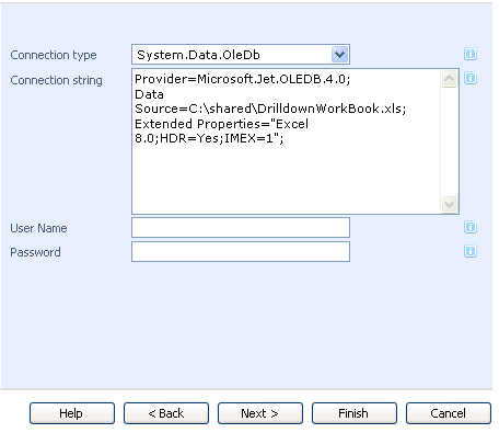
Figure 3: The connection type and connection string. -
In this step, an SQL query is used to allow our charts to access the spreadsheet data as required. The Pie chart will only require a simple SELECT statement like this:
SELECT * FROM [Countries$]In the above statement, the name of the Excel spreadsheet is used in the square brackets, and followed immediately by the $ character. This statement will retrieve the data for the Pie chart. Retrieving the data for the Column chart will require a slightly more complex SQL statement like this:
SELECT * FROM [Details$] WHERE Country=@CountryIn the above statement we use the Details spreadsheet, and we also define a parameter called Country that we will use to filter the data retrieved from that spreadsheet. By specifying the Country parameter, we can retrieve all of the data for any one country in our Details spreadsheet. Figure 4 shows how to set the Country parameter in step 3 of the wizard.
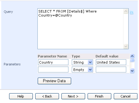
Figure 4: The SQL statement for the Column chart, and the Country parameter. -
In step 4 of the wizard, choose the Sales column for the y-axis of the Column chart, and the Region column, which displays the names of the chosen country's regions, for the x-axis. Click Finish to complete the task.
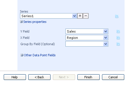
Figure 5: Choose the Sales column for the y-axis, and the Region column for the x-axis of the Column chart.
Each of the two charts has an assigned spreadsheet to use as their datasource, now we must get them to work together using a filter and the interactive feature of Dundas Chart for SharePoint™.
Add The Query String Filter
In this step we are going to add a Query String (URL) Filter web part and tell it to send its filtered results to the Column chart. Once added, this filter web part should be set up as shown in Figure 6 below. Give the filter a name, and tell it which parameter (the Country parameter) to use for the connection between it and the Column chart. You must also set a default value for this filter to use for when the Column chart is first rendered, we set Canada in Figure 6 below as the default country to display in this chart.
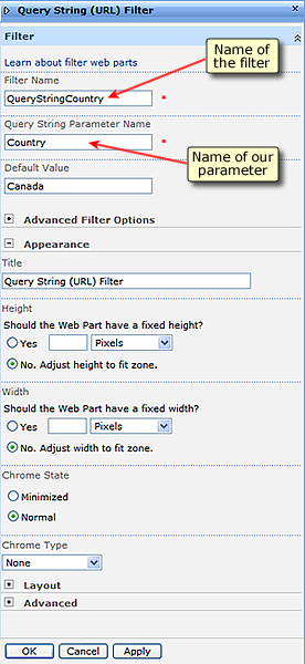 |
| Figure 6: The settings for the filter used in this example. |
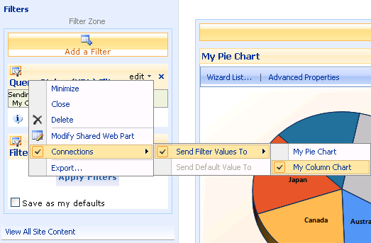
Now we must tell our the Query String (URL) Filter to send its filtered results to the Column chart. Figure 7 illustrates how to get the filter to send its filtered results to our Column chart web part which we have named My Column Chart. Your web part will probably have its own name, like Dundas Chart Web Part [1], or something similar, just choose the name of your Column chart web part from the menu choices to have the filter send its filtered results there.
 |
|
Figure 7: Connect both the Pie and Column chart to the Query String (URL) Filter. |
Once you perform the above step, the filter will display the dialog box shown in Figure 8 below. This dialog lets you choose which parameter it should send to the Column chart, since we set only one parameter, the Country parameter, then you can choose this parameter and click Finish to proceed.
 |
| Figure 8: Choose the Country parameter from the Configure Connection dialog. |
Set The Interactive Hyperlink Feature Of The Pie Chart
Since we are going to use the Pie chart as the dynamic component of our example, we must set up its clickable area to make it set the value of our Country parameter for our filter to use. Open the Chart Customization Wizard and proceed directly to the Interactive Features tab in the last step. Figure 9 below shows you how to set up the Series Hyperlink so that it will assign a value to our Country parameter, which will in turn be used by our filter to retrieve and filter its data, and then send that filtered data to the Column chart as required. This is the final step in linking all of the components together so that drilldown can be performed.
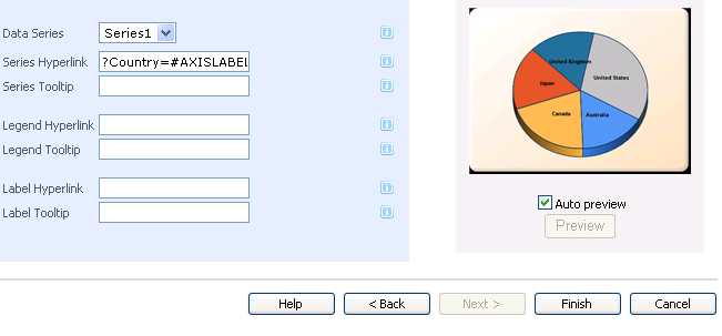 |
| Figure 9: The Country parameter is assigned the value of the axis label that was clicked. |
Putting It All Together
The drilldown process shown here can be described as follows:
- The Pie chart receives a click from the user, and as a result of that click it sets the Country parameter to the value of the axis label that was clicked.
- The Country parameter, now set, is sent to the Query String (URL) Filter which retrieves its data and filters it according to the value of the Country parameter.
- This filtered data gets sent from the filter web part to the Column chart web part where it is displayed.
In short, we can now perform drilldown on any one of the countries in our Pie chart, and display the results in our Column chart.
Some Tips For Displaying Results
There are a couple of properties that you can set to make displaying the results of a drilldown operation easier to see. The first is to set the LabelAutoFit property, and then set the Interval property of the x-axis labels shown in the Column chart. The label setting will allow the chart to show all of its x-axis labels vertically and avoid having any of those labels wrap their text. The Interval setting will guarantee that no x-axis labels are skipped when the chart is rendered.
Follow these steps to set the above mentioned properties:
- Go to Advanced Properties, and then Chart Areas.
- Within the Labels category, set the LabelAutoFit property to True.
- Under the LabelStyle node, set the Interval property to 1.
The charts displayed in Figure 10 below demonstrate this adjustment. The chart on the left has its x-axis labels partially missing, and the text in the labels showing is getting wrapped making it difficult to read. The overall display of the x-axis is not very good for the chart on the left.
The chart on the right demonstrates the effects of setting the LabelAutoFit property to True - that is that all labels on the x-axis now appear vertically without any distortive wrapping. The effects of setting the LabelStyle's Interval property to a value of 1 is easy to see as well since all of the intended x-axis labels are now showing.
Since the chart on the right has had its LabelAutoFit property set to True, its LabelAutoFitStyle property has also sprung into action by automatically setting the chart's overall size, as well as its label font size, the result is that all of its x-axis labels can be clearly displayed. Setting the LabelAutoFit property to True has set a chain reaction of beneficial adjustments in motion all of which make your charts much easier to read.
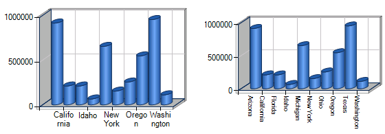 |
| Figure 10: The Column chart before setting the LabelAutoFit and LabelStyle Interval properties (shown left), and after setting those properties (shown right). |
 See Also
Chart Types
Pie Chart