


Overview
The Spline Range chart displays a range of data by plotting two Y values per data point, with each Y value drawn as a line chart. The range between the Y values can be filled with color, information, or even an image.
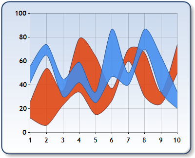
Figure 1: A Spline Range chart.
The first Y value is the high value, and the second Y value is the low value of the range.
Markers and labels are drawn on both the high and low lines simultaneously. In other words, there is no way to draw a marker for a point on the low line of the range, and not draw it on the high line of the range as well. Line colors, and all other visual attributes of the high and low lines are always the same.
The Spline Range chart is similar to the Range chart, the difference is that the line tension in this chart, which defaults to 0.5, can be adjusted.
 Note Note |
|---|
| Each data point must consist of two Y values, otherwise an exception will be thrown. |
|
Chart Details |
|
|
Number of Y values per point: |
2 |
|
Number of series: |
1 or more. |
|
Support markers: |
No |
|
Cannot be combined with: |
Doughnut, Pie, Bar, Stacked Bar charts, Polar, Radar, Pyramid, or Funnel |
|
Custom Attributes |
 See Also
Chart Types
Chart Types Overview
Range Chart