


Overview
This article describes the default legend of the chart. You are encouraged to read the topic on Custom Legend Items for more information on how to customize the legend.
There can be any number of legends displayed per chart. The legends are exposed via the Legends collection found on the root Chart class. At least one legend named "Default" will be in this collection at all times. To disable showing this legend in the chart, simply set the Enabled property to False.
Default Legend Entries
The Chart control by default automatically creates one or more legend entries for all chart types. The entries that are used for pie, doughnut, funnel and pyramid charts are the names of the plotted data points, while entries for all other chart types are the names of the plotted series. These items are referred to as the "default" legend items.
By default, all series will use the "Default" legend, which will contain the name of the series. Each series has a Legend property to define the name of the legend that will be used. Legend items will not be created for series or data points if their ShowInLegend property is set to False. The text for these default items can be changed using LegendText. Using this property, you can specify pre-defined keywords that will be replaced by their appropriate values.
For more information, see the topic on Using Keywords.
Alignment, Positioning and Spacing
By default, the legend is positioned in the top-right corner of the chart. However, this position can be modified by using the Docking and Alignment properties of the Legend.
The legend can also be associated with a chart area by use of the DockToChartArea property. This property specifies the name of the chart area for which the legend should be docked. In addition, the DockInsideChartArea property can be used to display the legend inside a chart area.
When the chart is not docked to a chart area, which means that the DockToChartArea property is set to False, then the MaxAutoSize property defines the maximum size (in percent) of the legend within the available chart area when the legend is automatically positioned. This property should be set if you wish to adjust the width or height of the legend after the docking properties have been set.
When the Position.Auto property is set to False, the Docking, Alignment, and DockInsideChartArea properties are ignored and the Position object's Height, Width, X and Y properties are used to position the legend.
 Note Note |
|---|
| The Legend uses a coordinate system of 0-100 (%), with the top-left corner being 0,0 and the bottom-right corner of the legend being 100,100. For more information on how the chart uses relative coordinates, refer to the topic on Chart Coordinates. |
Example
This example demonstrates how to set Legend attributes.
| Visual Basic |  Copy Code Copy Code |
|---|---|
| |
| C# | Copy Code |
|---|---|
| |
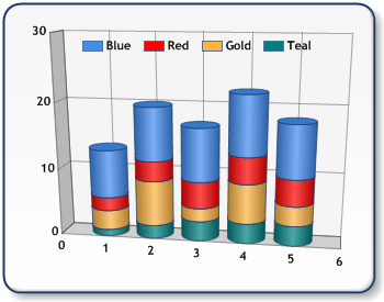
Figure 1: Docking top center alignment to "Default" chart area.
Working with Legend Text
Legend text by default is automatically sized. This can be disabled by setting the AutoFitText property to False, and the size of the legend's text is then determined by the LegendCell.Font property. If AutoFitText is True, the AutoFitMinFontSize property determines the minimum font size that a legend item can be when resizing.
The TextWrapThreshold property will define a limit on the number of characters that can be shown on one line before wrapping to another line. If you do not wish to wrap text in the legend, set TextWrapThreshold to zero.
When the legend contains many entries, LegendCell.InterlacedRows can be used to improve readability. When this property is set to True, it will display a back color that can be set using the LegendCell.InterlacedRowsColor property.
Legend Overflow
If the contents of the legend cannot fit into the given space, the Chart will automatically truncate legend entries. Three dots will be shown, to indicate that there are more entries that have not been shown.
Style Settings
You have the option of choosing one of three styles for the legend.
Table
By default, the legend is displayed as a series of items in a table. You can specify whether to expand items in the table width-wise or height-wise by setting the TableStyle property. By default, this property is set to Auto, meaning that the Chart will determine whether to draw the table wide or tall depending on the chart's alignment and positioning. This may cause the legend to be drawn using multiple legend item columns.
Column
The Column style displays the legend items as a column with multiple rows. This style is most commonly used when the legend is docked to the left or right of the chart.
Row
The Row style displays the legend items as a row with multiple columns. This style is most commonly used when the legend is docked to the top or bottom of the chart.
Using the Title Property
To add a title, use the Title property. Once you have entered text, you can specify a TitleSeparator and TitleSeparatorColor. This adds a line separator under the title to improve readability. If no text is entered into the Title property, the title separator will not be displayed. You can also use the '\n' string to add line breaks in your title.
Extending Default Legend Items
By default, the legend has two cell columns: a series symbol cell column (corresponding to the series indicator color) and a text cell column (corresponding to the series name). The CellColumns collection can be used to extend the functionality of the default legend. Any number of cell columns can be placed in any order, giving you the flexibility to extend the abilities of the default legend entries.
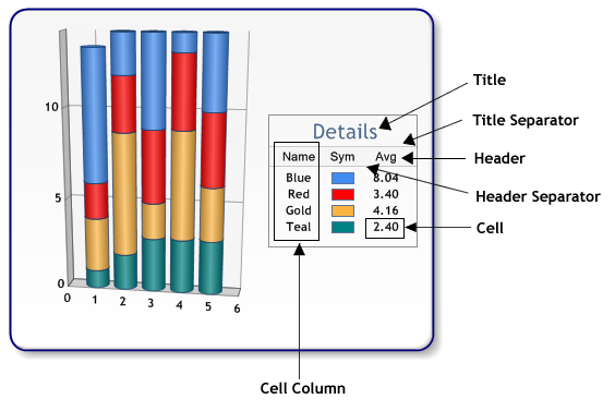
Figure 2: Elements of an Extended Default Legend.
Example
This example demonstrates how to text or series information to a legend cell.
| Visual Basic | Copy Code |
|---|---|
| |
| C# | Copy Code |
|---|---|
| |
If one or more cell columns are added to the legend, the default legend will be replaced by the number of items in the CellColumns collection. The MinimumWidth and MaximumWidth properties define the range of values that will be used to calculate the width of each cell column. You can adjust the alignment and spacing of a cell column by setting the Alignment and Margins properties. If you wish to customize the interlacing of rows in your legend, you can set the back color for each legend cell column using the LegendCellColumn.BackColor property.
In each cell column, you must specify which type of information will be displayed (Text or SeriesSymbol).
Cell Type Text Property
When the CellColumn.Type is set to Text, each cell in the legend item column will be determined by the Text property. By default, the #LEGENDTEXT keyword is used to place Series.LegendText in each cell column. However, you can use the Text property to set any keyword(s) that will be replaced by a value of the corresponding series.
Here is a listing of keywords that can be used for the Text property:
| Keyword | Replaced By |
| #LEGENDTEXT | Legend text of the series. |
| #AVG | Average value of the series. |
| #MIN | Minimum value of the series. |
| #MAX | Maximum value of the series. |
| #FIRST | First Y value of the series. |
| #LAST | Last Y value of the series. |
| #TOTAL | Total of all Y values in the series. |
For more information, see to the topic on Using Keywords.
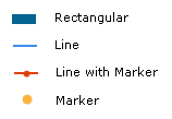
The SeriesSymbol Property
When the CellColumn.Type is set to SeriesSymbol, each cell in the legend item columns will contain a series symbol (Figure 3) of the same fill color as its corresponding series. You have the option of specifying the SeriesSymbol.Size of the series symbol. The SeriesSymbol.Size.Width value must be within the limit of the CellColumn.MinWidth property.
Figure 3: Types of Series Symbols.
Working with Headers
A header, positioned at the top of each cell column, can be used to appropriately title each cell column. Depending on the size of the table, the header may be repeated at the top of each legend item column (Figure 4).
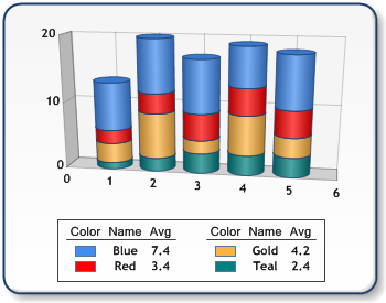
Figure 4: Repeating Headers.
To add a header to a cell column, you can use the HeaderText property. You can also specify a HeaderBackColor, which will appear if the HeaderText of any cell column is set. The header can further be distinguished by specifying a HeaderSeparator.
When using multiple legend item columns, you have the option of defining the ItemColumnSeparator type, as well as the spacing between columns using the ItemColumnSpacing property (Figure 5).
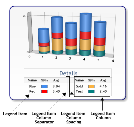
Figure 5: Using Legend Item Columns.
 See Also
How To
Custom Legend Items
Using Keywords
Getting Started
Chart Coordinate System