


Overview
This chart type displays multiple sets (i.e. series) of data as stacked columns, and the cumulative proportion of each stacked element always totals 100%.
The 100% stacked column chart is useful for measuring multiple series as a proportion vs. time. A good example of this would be displaying the proportion of a monthly mortgage payment that is applied to interest, and principal over time. The mortgage payment amount would represent 100%, while the interest and the principal values would be the two stacked elements that make up one column.
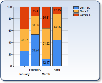
Figure 1: A 100% Stacked Column chart.
 Caution Caution |
|---|
| Stacked series must be aligned, otherwise data points will be rendered incorrectly. For more information on alignment see the topic on Aligning Series. |
|
Chart Details |
|
|---|---|
|
Number of Y values per point: |
1 |
|
Number of series: |
Two or more (one series acts as a bar chart). |
|
Support markers: |
No |
|
Cannot be combined with: |
Doughnut, Pie, Bar, Stacked Bar charts, Polar, Radar, Pyramid, or Funnel. |
|
Custom Attributes |
|---|
|
PointWidth, DrawingStyle (e.g. cylinders) |