


Overview
This topic demonstrates how to work with axis scales.
Automatic Scaling
Both the Minimum and Maximum axis properties can be set to a specific value, or they can be set to Auto, which is the default. If the minimum and maximum values are set to Auto, then depending on the axis, automatic scaling will determine their values from X or Y data point values.
If the Margin property is set to True which is the default, then automatic scaling will add a "gap" or an axis margin between the last data point and the border of the chart area. The size of this margin is determined automatically.
Setting The Axis Interval
Both axes and their associated grid lines, tick marks, and labels have Interval, IntervalOffset, IntervalType, and IntervalOffsetType properties.
The properties of the axis elements (e.g. major grid lines, etc.) are given higher priority as compared to the Axis properties. For example, if the Axis.Interval is five, and the Interval of a major grid line is three, then a value of three will be used for that major grid line's interval.
The minor grid lines and tick marks of an axis never have their interval-related properties affected by the property settings of the parent Axis object.
By default, an Axis object's interval-related properties are all set to Auto, while the interval-related properties of its associated major grid lines, major tick marks, and labels are set to NotSet. When an axis element, such as a major grid line, has its interval offset or not set, the value used for that property is taken from the Axis object.
To override this behavior you can set an interval-related property of a grid line, tick mark, or axis label to a value other than NotSet. For example, you could use the Interval, IntervalType, IntervalOffset, and IntervalOffsetType properties of the MajorGrid, MinorGrid, MajorTickMark, MinorTickMark, or LabelStyle object properties of an axis.
To set the IntervalType and IntervalOffsetType properties to NotSet, use DateTimeIntervalType.NotSet. Note that the Axis object cannot have these properties set to NotSet. To set these properties to Auto, use a value of DateTimeIntervalType.Auto.
To set the Interval and IntervalOffset properties to NotSet, use a Double.NaN value (not applicable to the Axis object). To set these properties to Auto, use a value of zero.
For more information about grid lines, and tick marks, see the topic on Grid Lines and Tick Marks.
 Note Note |
|---|
| By default, major grid lines, major tick marks, and labels are enabled if the axes are also enabled. In this case, their interval-related properties are calculated automatically. If the XValueType, or YValueType properties of the first series (that uses an axis) is DateTime, then the interval type for grid lines, tick marks, and labels of that axis will always be calculated automatically, regardless of the IntervalType setting. |
When Axis.Interval is set to Auto, the IntervalAutoMode property determines how many intervals should be calculated. If your chart is being resized or redrawn often, you can set the IntervalAutoMode property to VariableCount, in which case the Chart will dynamically calculate axis intervals. This is especially useful in situations where the chart intervals are displayed differently depending on their data.
Value axes can be either linear, which is the default, or logarithmic depending on the Logarithmic property setting.
| Note |
|---|
| Setting a categorical axis to logarithmic will result in an exception being thrown. |
Code Examples
We have included these code samples to help you get started.
Example
This example demonstrates how to work with two data series, where the first series uses the primary Y axis, the second series uses the secondary Y axis. The primary Y axis is defined as a linear scale, and the secondary axis uses a logarithmic scale. The base of the logarithm can be set using the LogarithmBase property. We assume that two series; "Series1", and "Series 2", have had five points each added at design-time. Further, we assume that the DundasBlue template has been applied to the original chart for appearance purposes.
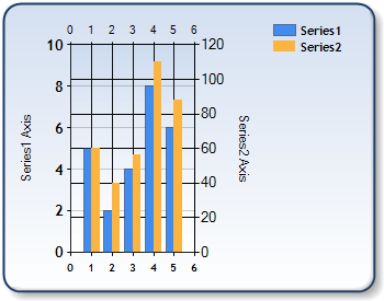
Figure 1: Two data series using the primary and secondary Y axes.
| Visual Basic |  Copy Code Copy Code |
|---|---|
| |
| C# | Copy Code |
|---|---|
| |
Example
This example demonstrates how to set different axis parameters using primary and secondary axes that have a different scale. The line chart below uses the secondary Y axis, and the bar chart uses the primary Y axis. The primary X axis has automatically set Minimum and Maximum properties, and the secondary Y axis has the Minimum and Maximum properties set manually. We assume that a series named Default, and another named Series2 have been added at design-time. Further, we assume that both series have had 6 data points added to them, and we also assume that the DundasBlue template has been applied to the original chart for appearance purposes.
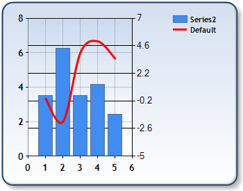
Figure 2: Combining a line chart and bar chart data.
| Visual Basic | Copy Code |
|---|---|
| |
| C# | Copy Code |
|---|---|
| |
 See Also
How To
Axis Types