


Overview
Advanced drawing features let you to enhancement your chart's appearance. Some of the features discussed in this article may be applied to the entire chart image, others are applied to individual chart elements. This level of control over drawing features lets you create many interesting, informative, and creative charts.
 Note Note |
|---|
| You can set many of the properties discussed in this article using the Customization Wizard, other properties not available in the wizard may be set using the Advanced Properties screen. |
2-D and 3-D Drawing Effects
Dundas Chart for SharePoint™ lets you enhance the look and feel of your chart by adding drawing styles to your column and pie charts.
Pie Charts
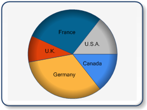
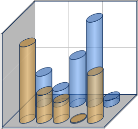
By setting the PieDrawingStyle custom attribute, you can achieve an impressive array of appearance styles. As seen below in Figure 1, the pie chart on the left is shown with a soft edge drawing style applied to it, and the pie chart on the right is shown using a concave drawing style. Both of these drawing styles will add a unique depth, and visual enhancement to your charts.
 |
 |
| Figure 1: A pie chart using the SoftEdge value (shown left), and using the Concave value (shown right). | |
Setting The DrawingStyle Property
Drawing styles are always applied to the Series element, and each chart type possesses its own set of applicable drawing styles. For example, there are two drawing styles available for pie charts including SoftEdge (shown in Figure 1 above on the left), and Concave (shown in Figure 1 above right).
The drawing style can be set in one of two ways, either by using the Advanced Properties screen, or by using the Customization Wizard.
Using The Customization Wizard
Follow these steps to set the DrawingStyle property by using the Customization Wizard:
- Set your chart type as desired.
- Choose Customization Wizard from the web part dropdown menu.
- Choose Chart Appearance Properties from the wizard's left-hand navigation pane.
- On the Appearance Themes tab, go to the Drawing Style dropdown menu and choose the drawing style desired.
- Click Finish to complete the task and exit the wizard.
Using The Advanced Properties Screen
Follow these steps to set the DrawingStyle property by using the Advanced Properties screen:
- Set your chart type as desired.
- Click on Advanced Properties button in the chart tool bar.
- Click on Series in the Advanced Properties left-hand navigation pane.
- In the properties browser, go to the Misc category, and expand the CustomAttributesEx node.
- Click on DrawingStyle property, and choose a style from the dropdown menu.
- Click Finish to complete the task and exit.
Some drawing features, like those that are applied to the chart image as a whole, will change the overall appearance of the chart. These all encompassing features include:
- Anti-aliasing. This feature lets you apply a smoothing effect to any lines and text that appears in your charts. The overall effect is a sharper chart image, with less distortion due to angled step-like pixellation of line segments.
- Soft shadows. This feature softens the shading used to draw the shadows in the chart image, and gives the chart a certain degree of visual depth.
- Border skins. Purely for visual impact, border skins make your chart images standout.
Some drawing features, like those that are applied to individual chart elements, help to distinguish and enhance your chart designs. These element specific features include Transparency, Gradients, Hatching, Images, and Color Palettes. You can use any combination of the above named features to give your charts a unique appearance.
For more information on charting elements, see the topic on Chart Elements.
 |
 |
 |
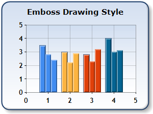 |
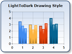
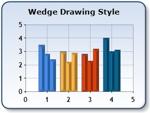
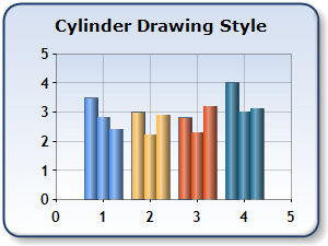
| Figure 2: A sample of DrawingStyle LightToDark (shown upper left), Wedge (shown upper right), Cylinder (shown lower left), and Emboss (shown lower right). | |
Color Palettes
Predefined sets of colors, called palettes, can be used while drawing a series. There are two types of Palettes used with the chart:
There are a number of options available for setting your chart's color palette. You can use the default color palette, one of the predefined color palettes, or you can define your own custom color palette for the chart to use. The series shown in the chart in Figure 3 below uses a Pastel color palette which is one of the predefined color palettes available.
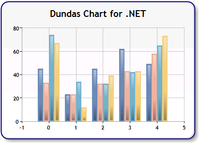 |
| Figure 3: The predefined Pastel color palette. |
Working With Custom Color Palettes
Dundas Chart for SharePoint™ gives you the flexibility to create your own custom color palettes. A custom palette lets you define your own set of colors to be used in drawing your chart's data Series or data points. The Chart's PaletteCustomColors property will allow you to define your own custom color palette, and once defined, the chart will use only those custom color palette values to color its Series or data points. Setting this property also tells the the charting web part control to ignore any other value that may be set for its Palette property.
Number of Colors Used
Most of the pre-defined palettes included in Dundas Chart for SharePoint™ employ more than 16 colors, this is purposely done to avoid having to re-use any of the palette's colors again when rendering the chart's Series, or datapoints. Therefore when you define a custom palette, you should consider how many Series or data points your chart will likely display, and then add a minimum of that number of colors to your custom color palette. If the number of data Series or data points rendered in the chart exceeds the number of custom palette colors defined, then the chart control will begin to re-use your custom palette's colors. This means that your chart will use the same color for more than one of its Series or data points, which could ultimately lead to ambiguities when analyzing the data plotted in the charting web part control.
Anti-Aliasing
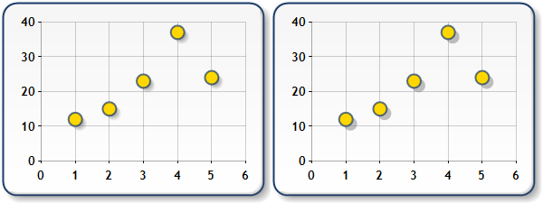
Anti-aliasing, or line smoothing, is a process that reduces the appearance of stair-like pixellation in angled or curved lines, and graphical chart elements. The anti-aliasing process effectively blends pixel colors along predefined boundaries to give angled or curved lines a more natural smoothened appearance. This is particularly useful for improving the drawing of angled text as seen in Figure 1 below. Anti-aliasing can be enabled or disabled using the Chart's AntiAliasing property.
 |
| Figure 4: Anti-aliasing turned off (shown left), and turned on (shown right). |
| Note |
|---|
| While it is true that the use of anti-aliasing will help you to produce lines and arcs that are smoother and therefore more visually appealing, it should also be noted that if a transparent color is used as the background color for your chart with anti-aliasing set to High, that this background color may appear incorrectly. This behavior is due to a fault in the .NET framework. Setting anti-aliasing to Normal will help to alleviate this problem. |
Anti-aliasing can be applied to drawn text, and primitive graphics like circles, rectangles, or squares.
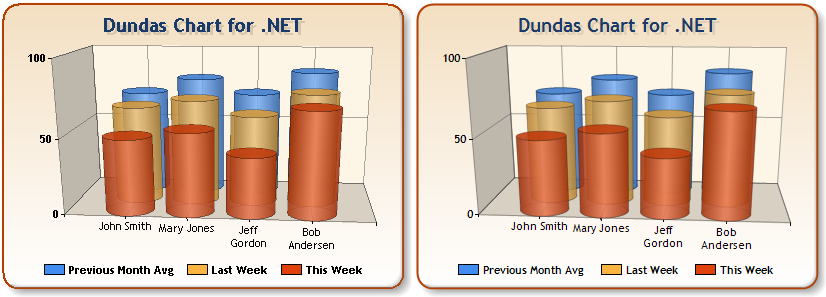
Using Soft Or Hard Shadows
You can apply a shadow to your chart's Series, as well as its individual data points, chart areas, or legend by using a combination of the ShadowOffset and ShadowColor properties. In addition to this, you can choose to employ either soft or hard shadows by setting the SoftShadows boolean property. When this property is set to True, soft edged gradient shadows are drawn behind your chart's elements. When it is set to False, sharp edged (hard) shadows are used behind your chart's elements.
You can also choose the color used to fill the shadow areas of the chart image. This is done by setting the ShadowColor property of individual chart elements. Figure 5 below illustrates the difference between soft and hard shadows.
 |
| Figure 5: Soft shadows are used for the chart on the left, normal (hard) shadows are used for the chart on the right. |
Border Skins
Border skins define the appearance of your chart's border, and are implemented using the BorderSkin property of the root Chart object. The SkinStyle property of the BorderSkinAttributes class lets you define the shape of the chart border. Figure 6 below illustrates several different examples of border skins, or border styles.
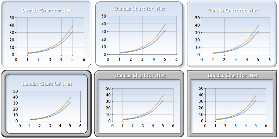 |
| Figure 6: This set of images represents a sample of BorderSkin properties; a Sunken SkinStyle, (shown top-left), a Emboss SkinStyle(shown top-middle), a Raised SkinStyle (shown top-right), a FrameThin1 SkinStyle (shown bottom-left), a FrameTitle6 SkinStyle (shown bottom-middle), and a FrameTitle3 SkinStyle(shown bottom-right). |
Some borders styles use a frame whose appearance can be changed by using the properties of the BorderSkin object. In Figure 7, the charts uses hatching to add depth and visual impact to the chart's border.
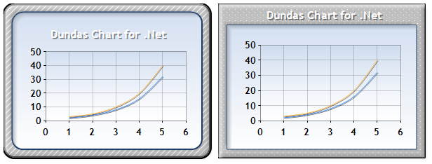 |
| Figure 7: Border skins with hatched frame styles. |
Page Color and Border Styles
Page Color
The PageColor property sets the color of the web page where the chart control is used. In the Figure 8 below we use a chart with its page color property set to blue.
 |
| Figure 8: The PageColor property set to blue. |
Border Styles
Border styles that employ a frame can display a chart title in two different ways. Borders with a thin frame display the title normally, thick borders display the chart title inside of the frame. As you select different border styles, the position of chart areas and the legend will automatically adjust to accommodate the border style chosen. If any additional adjustment is required, use the Position properties of the ChartArea, and Legend objects.
Transparency
The transparency properties of the charting web part can be accessed using either the Advanced Properties pane of the chart, or the Chart Customization Wizard. This feature lets you enhance your charts by making the chart's data series transparent without affecting the chart's frame. Figure 9 below illustrates a column chart that has had its transparency property set to 40% and as such renders its data Series in the manner shown.
 |
| Figure 9: The transparency property set to 40%. |
Gradient Fills
Linear gradients can be used to fill the background of many chart elements with a color whose intensity changes gradually as it fills the element. The BackColor (Color for Series and DataPoint elements) and BackGradientEndColor properties are used to define the "start" and "end" colors of the gradient fill. The BackGradientType property defines the direction of the gradient fill used.
Possible values for the BackGradientType property include:
- LeftRight.
- TopBottom.
- Center.
- DiagonalLeft.
- DiagonalRight.
- HorizontalCenter.
- VerticalCenter.
| Note |
|---|
| To display a gradient fill, the BackHatchStyle property must be set to "None", and the BackImage property must be set to "" (empty string). |
Hatching
Hatching is used to fill the background of a chart element with a lined (hatching) pattern. The BackColor (or Color for Series and DataPoint objects), and the BackGradientEndColor properties are used to define the foreground, and background color of the hatch. The BackHatchstyle property defines the style of hatching used, and the ChartHatchStyle determines the style in which the hatching pattern defined is used.
| Note |
|---|
| The BackImage property must be set to "" (indicating no value) in order to display a hatching pattern. |
Background Images
An image can be displayed as the background of any chart element. The BackImage property defines the URL to the image file, and the BackImageMode property determines how the image is displayed. This property is a ChartImageWrapMode type whose values include:
- Unscaled. The image is shown as is, and the BackImageAlign property can be used to set it's alignment.
- Scaled. The image is scaled to the size of the element area.
- Tile, TileFipX. The image is tiled in the element area.
The BackImageTranspColor property defines the color in the image which will appear transparent.
 See Also
Getting Started
Overview Of Chart Elements
Customization Wizard