


Overview
The customization wizard lets you alter the appearance of your charts so that you can achieve a look and feel to suit your needs. To access the customization wizard, you can:
- Click on the Wizard List... tool bar button, shown in Figure 1 below.
- Use the Web Part dropdown menu.
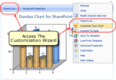 |
| Figure 1: Access the Customization Wizard by using either the Wizard List... button, or choose Customize Your Chart from the dropdown menu. |
The Customize Your Chart option in the Chart Wizard List, shown in Figure 2 below, gives you access to the web part customization wizard. Choose this option to begin using the customization wizard, you will quickly discover that this wizard has been designed to make altering all of your chart's appearance properties as easy as possible.
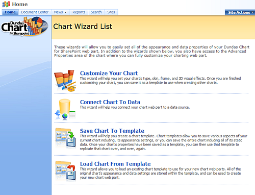 |
| Figure 2: The Chart Wizard List lets you work with the charting web part. |
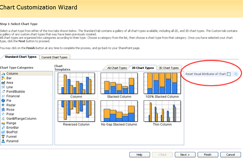
Once you have chosen the Customize Your Chart option, the wizard (shown in Figure 3 below) begins to guide you through the 3 step process of customizing your chart.
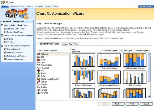
Figure 3: The Chart Customization Wizard begins to guide you through the 3 step process.
The 3 steps in the customization process include the following:
- Step 1: Select Chart Type.
- Step 2: Chart Appearance Properties.
- Step 3: Chart Element Properties.
There is a chart preview image that accompanies each step of the customization process, and lets you immediately see the impact that your settings will have on the chart web part image. This proves to be an exceptional feature when you are designing a specific chart for a specific use, and also becomes intuitively useful in determining the overall visual appeal of your charting SharePoint application, report, or dashboard. Below is a listing of each step along with a brief explanation of what is done in that step.
Step 1: Select a Chart Type
This step lets you select a chart type web part to use with your SharePoint application. You can select a chart type from any one of the Chart Type Categories, including 2D and 3D chart types.
Step 2: Chart Appearance Properties
Appearance Themes
Theme
Appearance themes are chart web part skins that apply specific settings to the visual properties of your chart. Each appearance theme employs a unique combination of visual property settings to achieve a specific look, feel, or style for that chart. This step lets you choose an appearance theme for your chart.
Drawing Style
The Drawing Style property adds 3D style depth and perspective to your 2D charts. It achieves this by adding lighting and shadow effects to the chart's data series thereby giving them a 3D appearance. It can also enhance your 3D bar and column charts by making them appear to be more realistic.
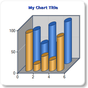
Transparency
The Transparency property, demonstrated in Figure 4 below, lets you set the transparency level of your chart's data series to create an engaging visual effect. The use of transparency in this manner is not, however, reserved for visual effect alone, by making the data series transparent, you allow the chart's background to show through it, and in doing so make that data easier to read and interpret against its scale.
Figure 4: A chart with its Transparency property set to 50%.
Size and Format
Chart Width And Chart Height
This property lets you control and specify your chart's width and height dimensions in pixel units.
Image Format
The chart image can be rendered using a number of different image formats, including the following:
- Bmp: Common Windows bitmap file format.
- Jpeg: Joint Photographic Experts Group file format is a compressed image file with support in virtually all Windows operating systems.
- Png: Portable Network Graphics file format is a lossless compression image file format that was designed to replace the GIF file format.
- Emf: Windows Enhanced Meta file format is an enhanced version of Windows Meta file that is supported in Windows NT and later operating systems.
- Svg: Scalable Vector Graphics file format is an XML based vector graphics format designed for use in web browsers, and as defined by the World Wide Web Consortium.
- Flash: This flexible image format lets you display your chart images, and add animation as desired.
 Note Note |
|---|
|
A Note About Adding Animation Choosing either the Flash or SVG image formats will allow you to add animation to your charts, no other image format supports animation. It is worthy to mention that the client machines that are going to display your charting web parts must have either the Flash player browser plugin, or the SVG viewer browser plugin installed in order to take advantage of Flash or SVG file format option respectively. Both of these plugins are available at Adobe. The Adobe corporation has announced that they will not be supporting SVG animation or the SVG viewer as of January 2008. |
This setting only appears when the image format value is either Flash or SVG. This lets you choose an animations mentioned above including None, Growing Together, Fading, Growing One By One, Moving From Top, and Growing And Fading.
This setting only appears when the image format value is either Flash or SVG and defines the length of time needed to complete the animation chosen. The duration property has a default value of 10 seconds, however you can enter any value in a range from 1 to 1000 seconds.
| Note |
|---|
| A animation duration value ranging from 10 to 20 seconds usually works best. |
For more information, see the topic on Advanced Drawing Features.
3D Properties Tab
Using 3D effects for your charts will create a rich visual experience for your users as they interact with your charting web part applications. The use of 3D charts helps to enhance your application by drawing your user's attention to the charting web parts there, however it should be noted that charts which use 3D effects may be more difficult for some users to analyse.
These properties allow you to employ 3D effects to give your charts added depth and perspective. You can set the following 3D properties to achieve the level of realism desired.
Show Chart In 3D
This box must be checked in order to access any of the other properties associated with adding dimension to charts.
Clustered
This box must be checked in order to cause the chart's data engine to cluster the data present within the chart's data series. Clustering data helps to simplify that data when plotted in your chart.
Right Angle Axes
This box must be checked to employ an X and Y axis that are perpendicular to each other.
Rotation Around X axis
This rotates the chart's area using the x-axis as its reference point. Rotating your chart image around an axis creates a different perspective, or angle, at which to view your chart.
Rotation Around Y axis
This rotates the chart's area using the y-axis as its reference point. Rotating your chart image around an axis creates a different perspective, or angle, at which to view your chart.
Perspective
Expressed as a percentage value, when this property is set to a value greater than zero it will override the Right Angle Axes property.
Light
This property lets you set the degree of lighting and shadow effects used to render your chart image. Using this property lets you control the degree of realism, with regards to the treatment of lighting, that is used to render your chart.
Wall Thickness
This property lets you set the number of pixels used to display your chart's defining walls.
Step 3: Chart Element Properties
This step lets you set all of the properties of your chart's elements including its Titles and Legends, Axes and Grid Lines, Data Labels and Markers, and also its Interactive Features. Each one of these items has its own sub-tab where you can set its individual properties. All of the changes you make are automatically shown in the chart preview image as you work.
Titles And Legend Tab
Titles
This section lets you set the Title properties of your chart. Within this section you can define your chart title's text, font, fill, border style, title style, and position. For example, the Chart Title textbox lets you enter a title to identify your chart more specifically. The Chart Title Position property allow you to define your title's specific placement within the chart area. Figure 6 below demonstrates the result of setting the chart's Title property along with the title's position, font, and font color.
 |
| Figure 6: A chart with its Chart Title properties set. |
Legend
A chart's legend adds the necessary context needed to view and analyse all of the data points displayed within a chart. This section lets you set the Show Legend property, and then define the legend's position and style within the charting area. Optionally, you can also choose to show your chart's legend outside of its chart area.
Axes And Grid Lines Tab
Axes and grid lines provide a visual cue for users to identify data values that are plotted on a chart. They provide the necessary scale, and context to view data points. Both the x-axis and y-axis possess their own grid lines, and the properties in this section will allow you to manipulate the visual settings of those grid lines to acquire the exact look and feel desired for all of your charts.
Data Labels and Markers Tab
Data labels and markers are elements whose only purpose is to highlight and define data. Labels help to illustrate the value of data points that appear within your chart, and markers go a long way to highlight those values to your users. These small esthetic enhancements can make it easier to spot data trends, and bring attention to the impact that certain data values have on your chart's data.
Interactive Features Tab
Interactive features are actions that you define for each component of your data series. You can have a different action defined for various specific mouse behaviors and components. The Series dropdown menu lets you choose a data series to work with, and once chosen, you can set that data series' interactive properties accordingly. In this article, we refer to the data series chosen from the dropdown menu as the current data series.
| Note |
|---|
| All interactive features are applied to their own specific data series. Therefore, you must first choose a data series from the Data Series dropdown menu, and then proceed to set its properties accordingly. In this article, we refer to the data series chosen from the dropdown menu as the current data series. |
The following is a listing of available properties in this section of the Customization Wizard interface:
- The Data Series dropdown menu is where you will choose the data series whose properties you want to set.
- The Series Hyperlink textbox lets you set a URL to jump to when the user clicks on the current data series.
- The Series Tooltip textbox lets you set the text to show in a tooltip window for when the user moves their mouse over the current data series.
- The Legend Hyperlink textbox lets you set a URL to jump to when the user clicks on the current data series displayed within the legend.
- The Legend Tooltip textbox lets you set the text to show in a tooltip window for when the user moves their mouse over the current data series displayed within the legend.
- The Label Hyperlink textbox lets you set a URL to jump to when the user clicks on a data point label in the current data series.
- The Label Tooltip textbox lets you set the text to show in a tooltip window for when the user moves their mouse over a data point label in the current data series.
Using Keywords
A Keyword is a specially formatted character sequence that gets replaced by an associated Chart Series value, or calculated value. Simply put, Keywords are words that can be used to display some type of data within a chart element. Using Keywords gives you the added flexibility to assign custom values to many of the Chart's elements.
The following table provides a list of supported keywords:
| Keyword | Will Get Replaced By The |
|---|---|
| #VALX |
X value of data point. |
|
#VAL, #VALY, #VALY2, #VALY3, ... |
Y values of the data point. |
|
#SER |
Series name. |
|
#LABEL |
Data point label. |
| #INDEX | Data point index. |
| #PERCENT | Percentage of the data point Y value. |
| #TOTAL | Total of all Y values in the series. |
| #LEGENDTEXT | Legend text. |
| #AVG | Average of all Y values in the series. |
| #MIN | Minimum data point of all Y values in the series. |
| #MAX | Maximum data point of all Y values in the series. |
| #FIRST | First data point of all Y values in the series. |
| #LAST | Last data point of all Y values in the series. |
Reset All Visual Attributes of New Charts
When custom charts exist within a project, and a new chart type is chosen, you can set all of the visual attributes of the new chart to their default values by simply putting a check in the Reset Visual Attributes of Chart checkbox as shown (circled in red) in Figure 7 below.
 |
|
Figure 7: Put a check in the Reset Visual Attributes of Chart checkbox to reset all of the visual attributes when creating a new chart. |