


Overview
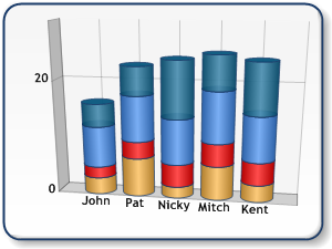
Charts are plotted using X and Y axes. Y axes are always value axes used to plot data (e.g. number of sales, etc.). X axes are normally categorical (e.g. months of the year, etc.), but can be used as value axes as well (e.g. a scatter-type plot). Refer to the diagram below for an illustration of value versus categorical axes.
 |
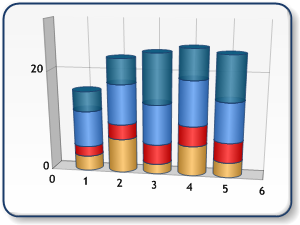 |
| Figure 1: A chart using categorical x-axis (shown left), and a chart using value x-axis (shown right). | |
There are two sets of axes: Primary and Secondary axes. Primary axes for all charts, except the bar charts, are located at the bottom (primary X axis) and left (primary Y axis) border of the chart area. The secondary axes are located at the right (secondary X axis), and top (secondary Y axis) border of the chart area as shown in Figure 2 below.
To set which axes a series is plotted against use the YAxisType and XAxisType properties of a Series object.
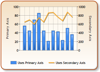
Figure 2: The primary and secondary axes.
The bar and stacked bar charts have their X, and Y axes rotated by 90 degrees. This means that the Y axes are horizontal (primary is bottom axis, secondary is top axis), and the X axes are vertical (primary is left axis, secondary is right axis). Refer to Figure 3 below for a pictorial representation of bar chart axes.
 Note Note |
|---|
|
Pie and Doughnut charts do not use axes. |
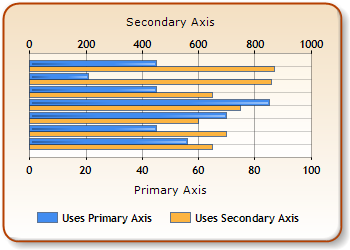
Figure 3: A bar chart's axes.