


Overview
Advanced drawing features allow you to enhancement your chart's appearance. Some of the features discussed in this article may be applied to the entire chart image, others are applied to individual chart elements. This level of control over drawing features allows you to create many interesting, informative, and creative charts.
2-D and 3-D Drawing Effects
Dundas Chart for ASP.NET allows you to enhance the look and feel of your chart by adding drawing styles to your column and pie charts.
Pie Charts
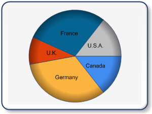
By setting the PieDrawingStyle property, you can achieve an impressive array of appearance styles. As seen below in Figure 1, the pie chart on the left is shown with a soft edge drawing style, and the pie chart on the right is shown using a concave drawing style. Both of these drawing styles will add a unique depth, and visual enhancement to your charts.
 |
 |
| Figure 1: A pie chart using the SoftEdge value (shown left), and using the Concave value (shown right). | |
Setting The DrawingStyle Property
To set the DrawingStyle property, follow these steps:
- Set your chart type.
- Click on Series (Collection) in the Properties browser.
- Go to the Custom Attributes category, and click on DrawingStyle.
- Choose a DrawingStyle value from the list.
- Click OK to exit.
Some drawing features, like those that are applied to the chart image as a whole, will change the overall appearance of the chart image. These all encompassing features include:
- Anti-aliasing. This feature allows you to apply a smoothing effect to lines and text that appears in your charts. The overall effect is a sharper chart image, with less distortion due to angled step-like pixellation.
- Soft shadows. This feature gives your charts a certain degree of visual depth, which is aesthetically pleasing.
- Border skins. Purely for visual impact, border skins make your chart images standout.
Some drawing features, like those that are applied to individual chart elements, help to distinguish and enhance your chart designs. These enhancing features include:
- Transparency.
- Gradients.
- Hatching.
- Images.
- Color Palettes.
You can use any combination of the above named features to give your charts a "Signature" appearance and charm all their own. These features help you to set your chart designs apart from all of the others, and allow you to employ a highly customizable aesthetic look and feel to all of your charting applications.
For more information on charting elements, see the topic on Chart Elements.
 |
 |
 |
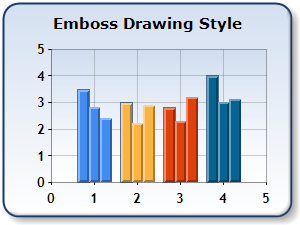 |
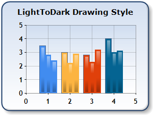
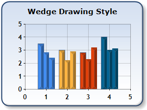
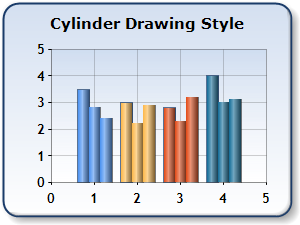
| Figure 2: A sample of DrawingStyle LightToDark (shown upper left), Wedge (shown upper right), Cylinder (shown lower left), and Emboss (shown lower right). | |
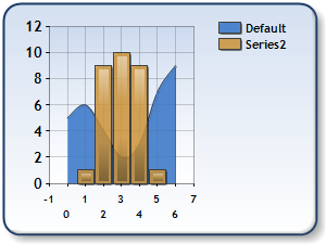
Color Palettes
Predefined sets of colors can be used while drawing a series. There are two types of palettes used with the chart: one Palette for the root chart object, and one palette for each series. You can choose to use the default color palette, or you can explicitly set the color palette of your choice. The series shown in the chart in Figure 3 below uses a custom pastel color palette.
 |
| Figure 3: A custom pastel color palette. |
For more information on color palettes, refer to the topic on Appearance of Data.
Working with Custom Color Palettes
Dundas Chart for ASP.NET gives you the flexibility to create and use your own custom color palettes. A custom palette allows you to define your own set of colors to be used for drawing Series or data points. When you define color values for the Chart.PaletteCustomColors property, then your Chart will only use those values to color its Series or data points. Setting this property also tells the the charting control to ignore any value that may be set for its Chart.Palette property.
Most of the pre-defined palettes included in Chart contain more than 16 colors. When you define a custom palette, you should consider how many Series or data points your chart will display, and then add at least that number of colors. If there are a greater number of Series or data points than there are custom palette colors in your chart, the control will begin reusing your palette colors for more than one Series. The reuse of colors in a custom color palette may be confusing, and should therefore be avoided.
Anti-Aliasing
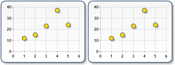
Anti-aliasing, or smoothing, is a technique that reduces the appearance of stair-like pixels in angled lines, and other graphical chart elements. It effectively blends the pixel colors along boundaries to produce a more natural smoothen ed appearance, and also improves the drawing of angled text as seen in Figure 4 below. Anti-aliasing can be enabled or disabled using the AntiAlias property.
 |
| Figure 4: Anti-aliasing turned off (shown left), and turned on (shown right). |
 Caution Caution |
|---|
| While it is true that the use of anti-aliasing will help you to produce lines and arcs that are smoother and therefore more visually appealing, it should be noted that if a transparent color is used as the background color for your chart with anti-aliasing set to High, that this background color may appear incorrectly. This behavior is due to a fault in the .NET framework. Setting anti-aliasing to Normal will help to alleviate this problem. |
Soft or Hard Shadows
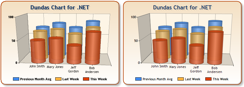
You can apply a shadow to your chart's series, as well as its individual data points, chart areas, or legend by using a combination of the ShadowOffset and ShadowColor properties. You can choose either soft or hard shadows by setting the SoftShadows boolean property. When this property is set to true, soft edged gradient shadows are drawn behind your chart's elements, otherwise sharp edged, or hard, shadows are used. You can choose the color used to fill the shadow area by using the ShadowColor property. Figure 5 below illustrates the difference between soft and hard shadows.
 |
| Figure 5: Soft shadows are used for the chart on the left, normal (hard) shadows are used for the chart on the right. |
Border Skins
Border skins control the appearance of your chart's border, and are implemented using the BorderSkin property of the root Chart object. The SkinStyle property of the BorderSkinAttributes class allows you to define the shape of the chart border. Figure 6 below illustrates several different examples SkinStyle Property of border skins, or styles.
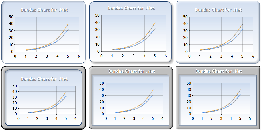
Figure 6: This set of images represents a sample of BorderSkin properties; a Sunken SkinStyle, (shown top-left), a Emboss SkinStyle(shown top-middle), a Raised SkinStyle (shown top-right), a FrameThin1 SkinStyle (shown bottom-left), a FrameTitle6 SkinStyle (shown bottom-middle), and a FrameTitle3 SkinStyle(shown bottom-right).
Some borders styles use a frame whose appearance can be changed by using the properties of the BorderSkin object. In Figure 7, the charts uses hatching to add depth and visual impact to the chart's border.
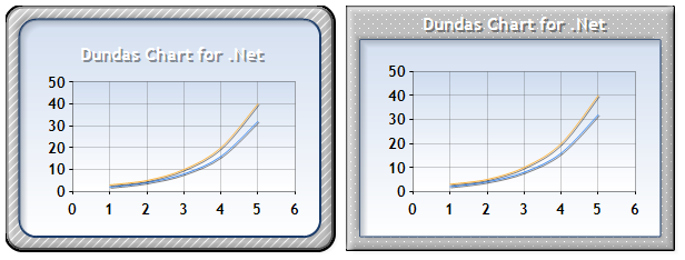
Figure 7: Border skins with hatched frame styles.
Page Color and Border Styles
The PageColor property sets the color of the Windows Forms page where the chart control is used. In the Figure 8 below we use a chart with its page color property set to blue.
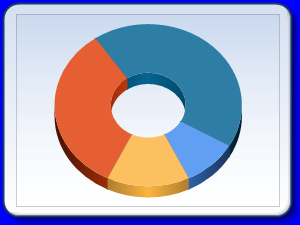
Figure 8: The PageColor property set to blue.
Border styles with a frame can display a chart title in two different ways. Borders with a thin frame display the title normally, thick borders display the chart title inside of the frame. The chart in Figure 9 below uses a "FrameTitle4" border style. As you select different border styles, the position of chart areas and the legend will automatically adjust to the border size. If any additional adjustment is required, use the Position properties of the ChartArea, and Legend objects.
Example
This example demonstrates how to use a border skin with a thick frame. We assume that data has been added to a spline chart series at design-time. Finally we assume, that a DundasBlue template was added. This example will generate a chart image that is very similar to the one shown below.
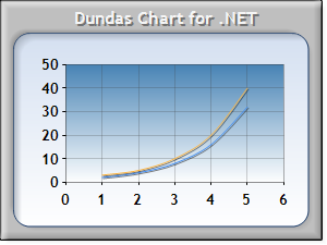
Figure 9: chart with a border.
| Visual Basic .Net |  Copy Code Copy Code |
|---|---|
| |
| C# | Copy Code |
|---|---|
| |
Transparency
In GDI+, a color is a 32-bit value with 8 bits per component. The 8-bit components that comprise a color include the alpha, red, green, and blue color components. The alpha value indicates the transparency of the color, and in actual fact, determines the extent to which that color is blended with the background color. Alpha values range from 0 through 255, where 0 represents a fully transparent color, and 255 represents a completely opaque color. You can use the Color.FromArgb method to create semi-transparent colors, and the Color.Transparent value can be used to specify any color that you want to make completely transparent.
Example
This example demonstrates how to define two series as being semi-transparent. We assume that two series; a column with a light to dark drawing style, and a range were added at design-time. Finally we assume, that a DundasBlue template was added. This example will generate the chart image shown below.
Figure 10: Transparency.
| Visual Basic .Net | Copy Code |
|---|---|
| |
| C# | Copy Code |
|---|---|
| |
Gradients
Linear gradients can be used to fill the background of many chart elements with a color that changes gradually as it fills the element. The BackColor (or Color for Series, and DataPoint objects), and BackGradientEndColor properties are used to define the "start" and "end" colors of the gradient fill. The BackGradientType property defines the direction of the gradient fill used.
Possible values for the BackGradientType property include:
- LeftRight.
- TopBottom.
- Center.
- DiagonalLeft.
- DiagonalRight.
- HorizontalCenter.
- VerticalCenter.
 |
To display a gradient fill, the BackHatchStyle property must be set to "None", and the BackImage property must be set to "" (empty string). |
Example
This example demonstrates how to specify a gradient color for a chart. We assume that a line series with markers was populated at design-time.
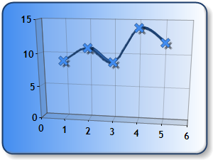
Figure 11: Gradient colors.
| Visual Basic .Net | Copy Code |
|---|---|
| |
| C# | Copy Code |
|---|---|
| |
Hatching
Hatching is used to fill the background of a chart element with a lined (hatching) pattern. The BackColor (or Color for Series and DataPoint objects), and the BackGradientEndColor properties are used to define the foreground, and background color of the hatch. The BackHatchstyle property defines the style of hatching used, and the ChartHatchStyle determines the style in which the hatching pattern defined is used.
| Note |
|---|
| The BackImage property must be set to "" in order to display a hatching pattern. |
Example
This example demonstrates how to specify a hatching pattern for a plotted series. We assume that a series of chart type "Bar" was added at design-time, along with its data. Finally we assume, that a DundasBlue template was added.
 |
| Figure 13: Hatching pattern for a plotted series. |
| Visual Basic .Net | Copy Code |
|---|---|
| |
| C# | Copy Code |
|---|---|
| |
Background Images
An image can be displayed as the background of any chart element. The BackImage property defines the URL to the image file, and the BackImageMode property determines how the image is displayed. This property is a ChartImageWrapMode type whose values include:
- Unscaled. The image is shown as is, and the BackImageAlign property can be used to set it's alignment.
- Scaled. The image is scaled to the size of the element area.
- Tile, TileFipX. The image is tiled in the element area.
The BackImageTranspbindingColor property defines the color in the image which will appear transparent.
Example
This example demonstrates how to specify a background image that is used for all data points in a series. We assume a column chart series was added at design-time, along with 4 data points. Finally, we assume that a WarmTones template has been applied.
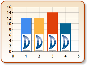
Figure 12: Background image.
| Visual Basic .Net | Copy Code |
|---|---|
| |
| C# | Copy Code |
|---|---|
| |
|
When a chart's appearance is set using the toolbar, the resulting appearance properties are saved within the Chart object. Therefore, if you want to programmatically alter a chart's appearance, and you also want to have that chart's UI enabled, then you must place the code that alters the chart after the select chart type command (or 3D command) is likely to be executed. |
Highlighting Elements With Markers And Borders
Many Chart elements can be highlighted with markers or borders by using the functionality of the Selection class. This class allows you to programmatically select elements and highlight them as desired.
Example
This example demonstrates how to use the SelectionManagerExtended class with its SelectObject member to highlight a legend chart element.
| Visual Basic .Net |  Copy Code Copy Code |
|---|---|
|
' Add this namespace. imports Dundas.Charting.WinControl.Utilities ' Create the SelectionManagerExtended object. Dim selectionManager As SelectionManagerExtended = Nothing ' When the form loads. Private Sub Form1_Load(ByVal sender As Object, ByVal e As EventArgs) selectionManager = DirectCast(chart.GetService(GetType(SelectionManagerExtended)), SelectionManagerExtended) ' Enable the selection (Enabled by default) selectionManager.EnableSelection = True ' Adjust the Marker properties. selectionManager.MarkerColor = Color.Red selectionManager.MarkerSize = 4 selectionManager.MarkerStyle = MarkerStyle.Square ' Wire up your event handler. AddHandler selectionManager.SelectObject, AddressOf selectionManager_SelectObject End Sub Private Sub selectionManager_SelectObject(ByVal sender As Object, ByVal e As CancelEventArgs) ' Get the selected object. Dim obj As Object = selectionManager.GetSelectedObject() ' Get the selected chart element type. ' Do something with the element. If selectionManager.GetChartElementType() = ChartElementType.LegendItem Then End If End Sub | |
| C# | Copy Code |
|---|---|
|
// Add this namespace. using Dundas.Charting.WinControl.Utilities; // Create the SelectionManagerExtended object. SelectionManagerExtended selectionManager = null; // When the form loads. private void Form1_Load(object sender, EventArgs e) { selectionManager = (SelectionManagerExtended)chart.GetService(typeof(SelectionManagerExtended)); // Enable the selection (Enabled by default) selectionManager.EnableSelection = true; // Adjust the Marker properties. selectionManager.MarkerColor = Color.Red; selectionManager.MarkerSize = 4; selectionManager.MarkerStyle = MarkerStyle.Square; // Wire up your event handler. selectionManager.SelectObject += new CancelEventHandler(selectionManager_SelectObject); ... } void selectionManager_SelectObject(object sender, CancelEventArgs e) { // Get the selected object. object obj = selectionManager.GetSelectedObject(); // Get the selected chart element type. if (selectionManager.GetChartElementType() == ChartElementType.LegendItem) { // Do something with the element. ... } } | |
Example
This example demonstrates how to use the SelectionManagerExtended class with the MouseClick event. In the example below, when the user clicks on a data point, it is highlighted. If the user wants to highlight all of the datapoints within the Series, then clicking on the datapoint again will highlight all of the datapoints within the Series.
| Visual Basic .Net | Copy Code |
|---|---|
|
' Add this namespace. imports Dundas.Charting.WinControl.Utilities Private selectionManager As SelectionManagerExtended = Nothing ' When the form loads. Private Sub Form1_Load(ByVal sender As Object, ByVal e As EventArgs) selectionManager = DirectCast(chart.GetService(GetType(SelectionManagerExtended)), SelectionManagerExtended) ' Enable the selection (Enabled by default) selectionManager.EnableSelection = True AddHandler chart.MouseClick, AddressOf chart1_MouseClick End Sub ' Handle the MouseClick event. Private Sub Chart1_MouseClick(ByVal sender As Object, ByVal e As MouseEventArgs) selectionManager.SelectionPoint = New Point(e.X, e.Y) End Sub | |
| C# | Copy Code |
|---|---|
|
// Add this namespace. using Dundas.Charting.WinControl.Utilities; SelectionManagerExtended selectionManager = null; // When the form loads. private void Form1_Load(object sender, EventArgs e) { selectionManager = (SelectionManagerExtended)chart.GetService(typeof(SelectionManagerExtended)); // Enable the selection (Enabled by default) selectionManager.EnableSelection = true; chart.MouseClick +=new MouseEventHandler(chart1_MouseClick); } // Handle the MouseClick event. void Chart1_MouseClick(object sender, MouseEventArgs e) { selectionManager.SelectionPoint = new Point(e.X, e.Y); } | |
 See Also
Getting Started
Chart Elements